Search that works the way lawyers think
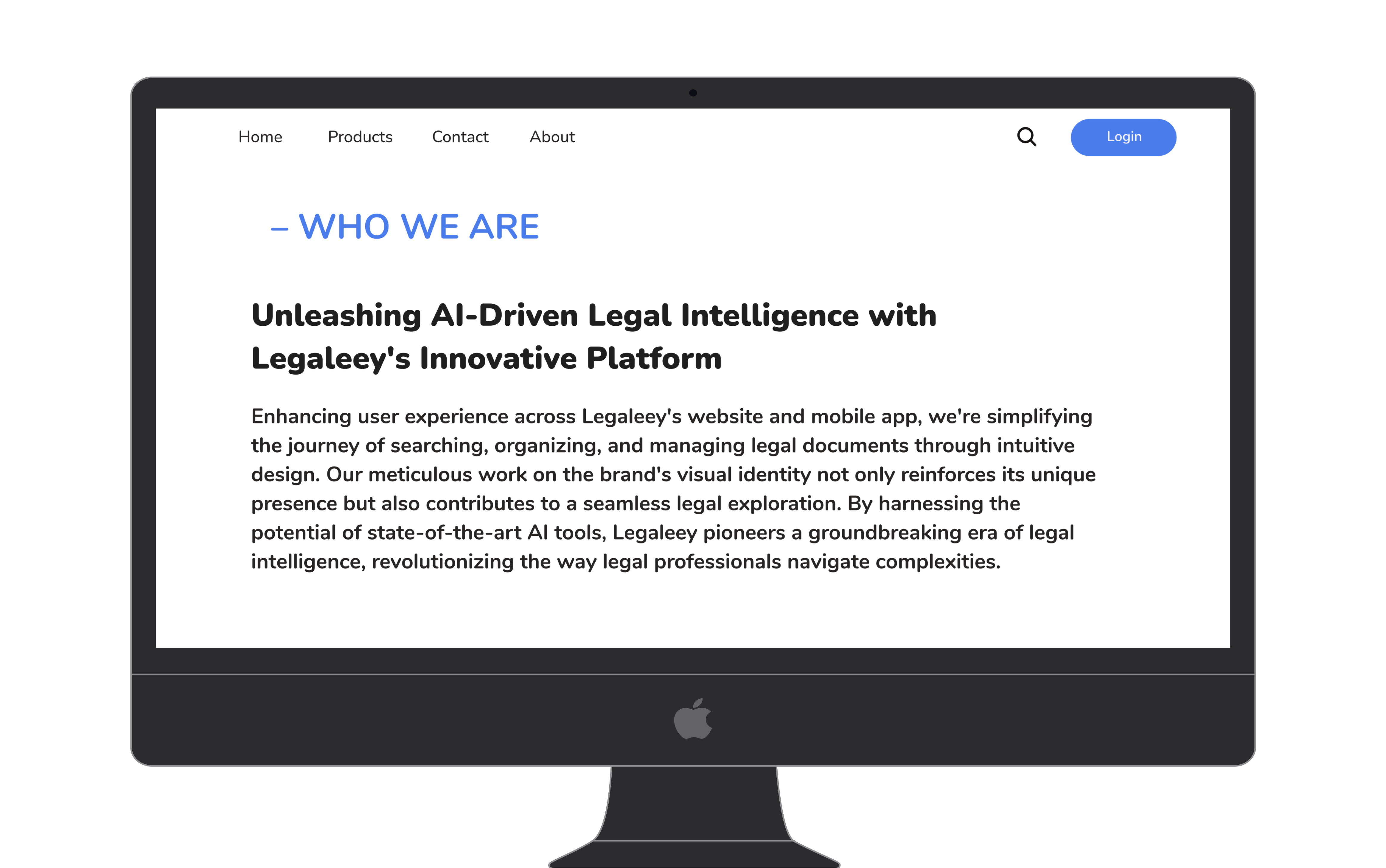
Legaleey is an AI driven document search service built for legal firms. The goal: reduce the time lawyers spend finding and locating items within contracts, so they can focus on judgment rather than document retrieval.
The demo release was designed to validate three core questions: whether AI driven search meets customer needs, how users interact with search options and filters, and whether the structured output is understandable and genuinely valuable to an experienced legal professional.
My Role
From the first user interview to the final high fidelity screen, this project was designed end to end. The research phase involved direct interviews with practicing lawyers to map how they actually search within contracts, where existing tools failed them, and what a better workflow would need to deliver. Those findings drove the information architecture and all nine user flows, built from scratch without an existing design system or component library to pull from. Screens moved from rough wireframes through multiple rounds of iteration, with each fidelity increase pressure tested against the four design principles established at the start. The result is a product where every interaction can be traced back to something a real user said in a research session.
Platform
Desktop first web application, designed for PC users. Lawyers are power users of Adobe Acrobat and Microsoft Word and expect familiar, structured UI patterns.
Project Type
B2B SaaS · Legal Technology · AI Search · Demo Release
Hours lost to the wrong kind of search
Contract review is one of the most time-intensive tasks in legal practice. Lawyers at all levels spend a disproportionate share of their working hours not reading contracts but hunting within them.
The tools available, primarily Adobe Acrobat and Microsoft Word, were built for document creation and reading, not structured retrieval. Their search functions return raw text matches with no understanding of legal structure, clause type, or semantic context.
Experienced lawyers spend 40 to 50% of contract review time on manual search, pulling up keyword matches that lack structure, context, or clause awareness. There is no way to search across documents, filter by legal concept, or export findings in a usable format.
User Profile
The target user is an experienced lawyer who is deeply familiar with complex Google searches and proficient in Adobe Acrobat and Microsoft Word. They are not a beginner. They have high expectations for precision, speed, and information density.
Goal: find specific clauses, parties, and dates across dozens of contracts without rereading every document.
Goal: quickly surface risk exposure across a portfolio of contracts before client meetings.
What legal search actually needs
Secondary research and user observation sessions with legal professionals revealed a consistent pattern of workarounds, frustration, and lost time in existing search workflows.
Key Pain Points
Acrobat returns raw keyword hits. It cannot distinguish a mention of a party name in a recital from a material obligation in a covenant.
Lawyers managing portfolios of 10 to 100 contracts must open each file individually. There is no way to query across a set.
Even when the right text is found, getting it into a memo, spreadsheet, or summary requires manual copying. There is no structured export path.
Reviewing dense legalese while also managing a search UI creates significant cognitive load, especially under time pressure before hearings or closings.
Lawyers do not want a smarter Ctrl+F. They want a tool that understands the structure of a contract well enough to answer questions like: who are the parties, what are the termination conditions, and are there any governing law clauses that deviate from the norm?
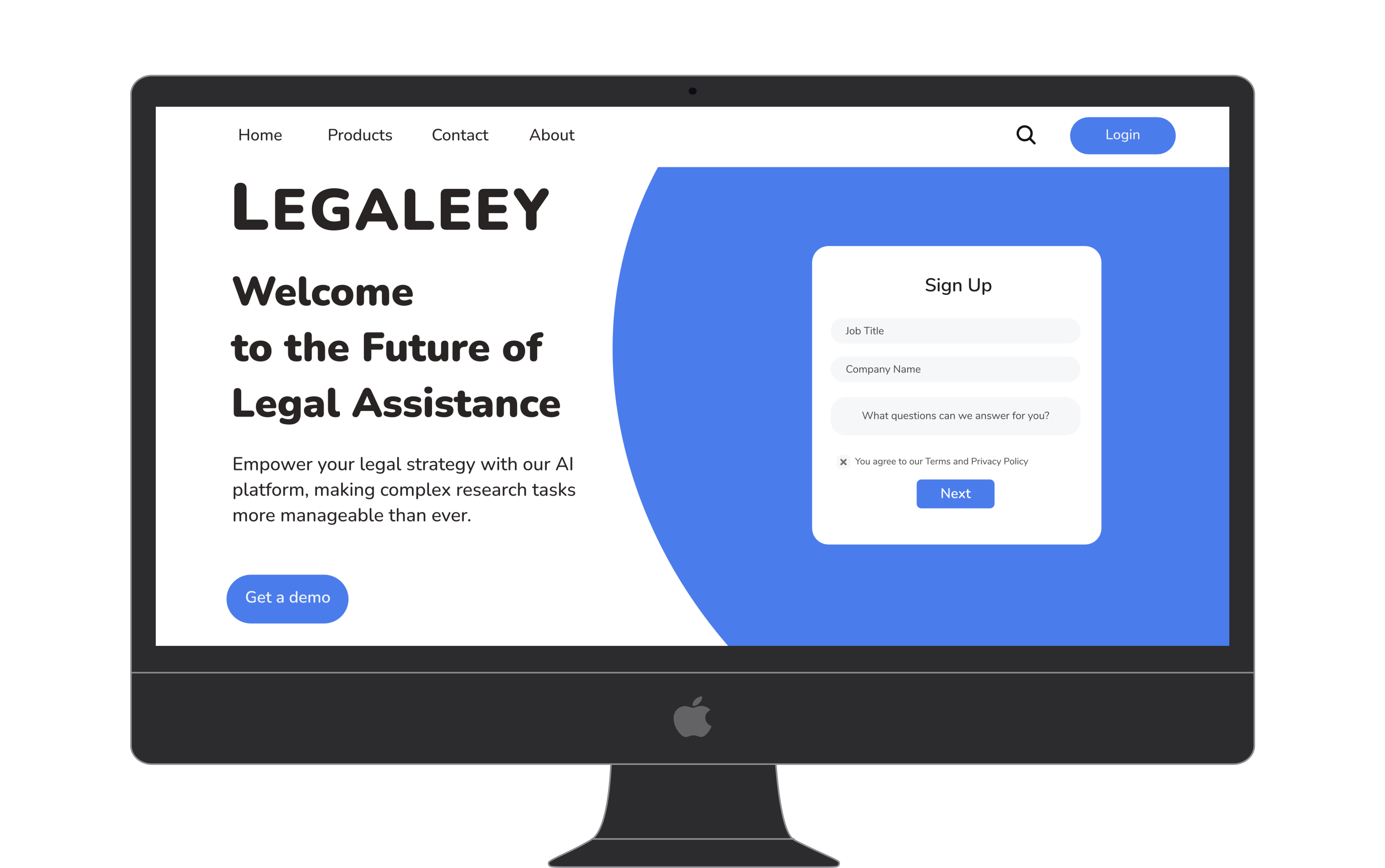
The marketing site was designed to establish the AI value proposition before any account commitment was required. Lawyers evaluating new tools need to understand the core benefit before engaging with a sign up flow.
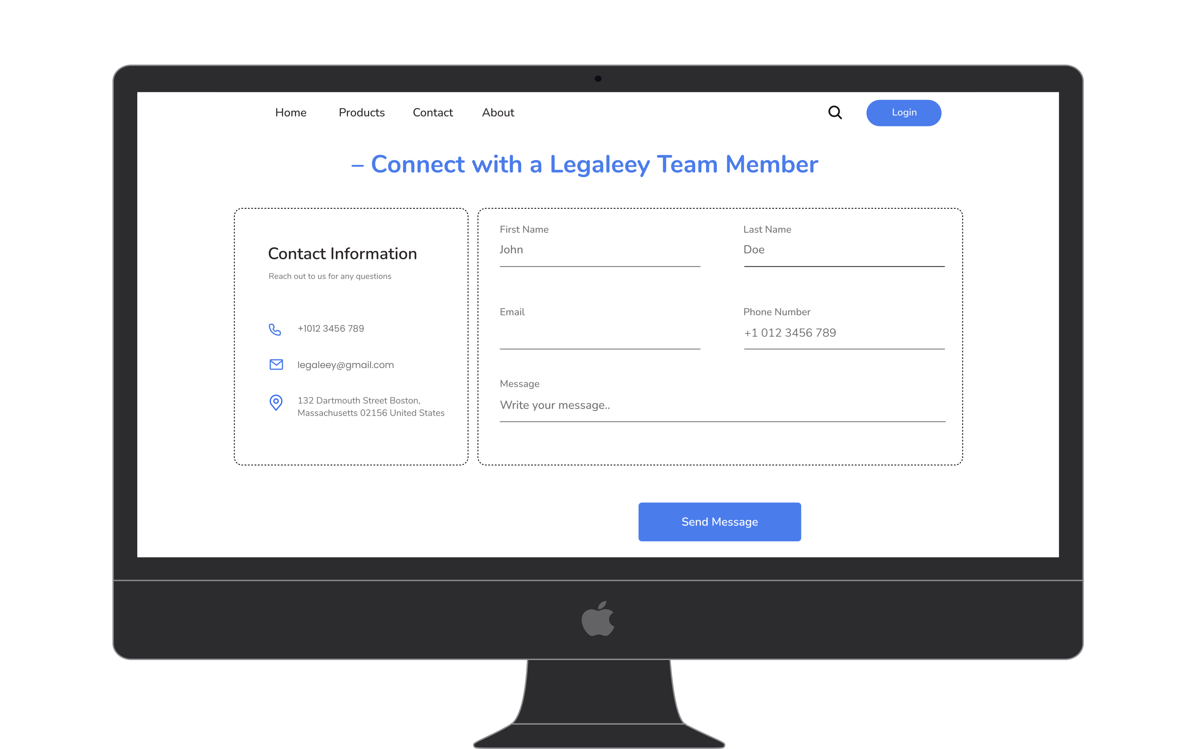
Direct firm outreach was prioritized because legal procurement decisions require a human touchpoint before account creation. The contact page was built into the product rather than linked externally to keep evaluation friction low.
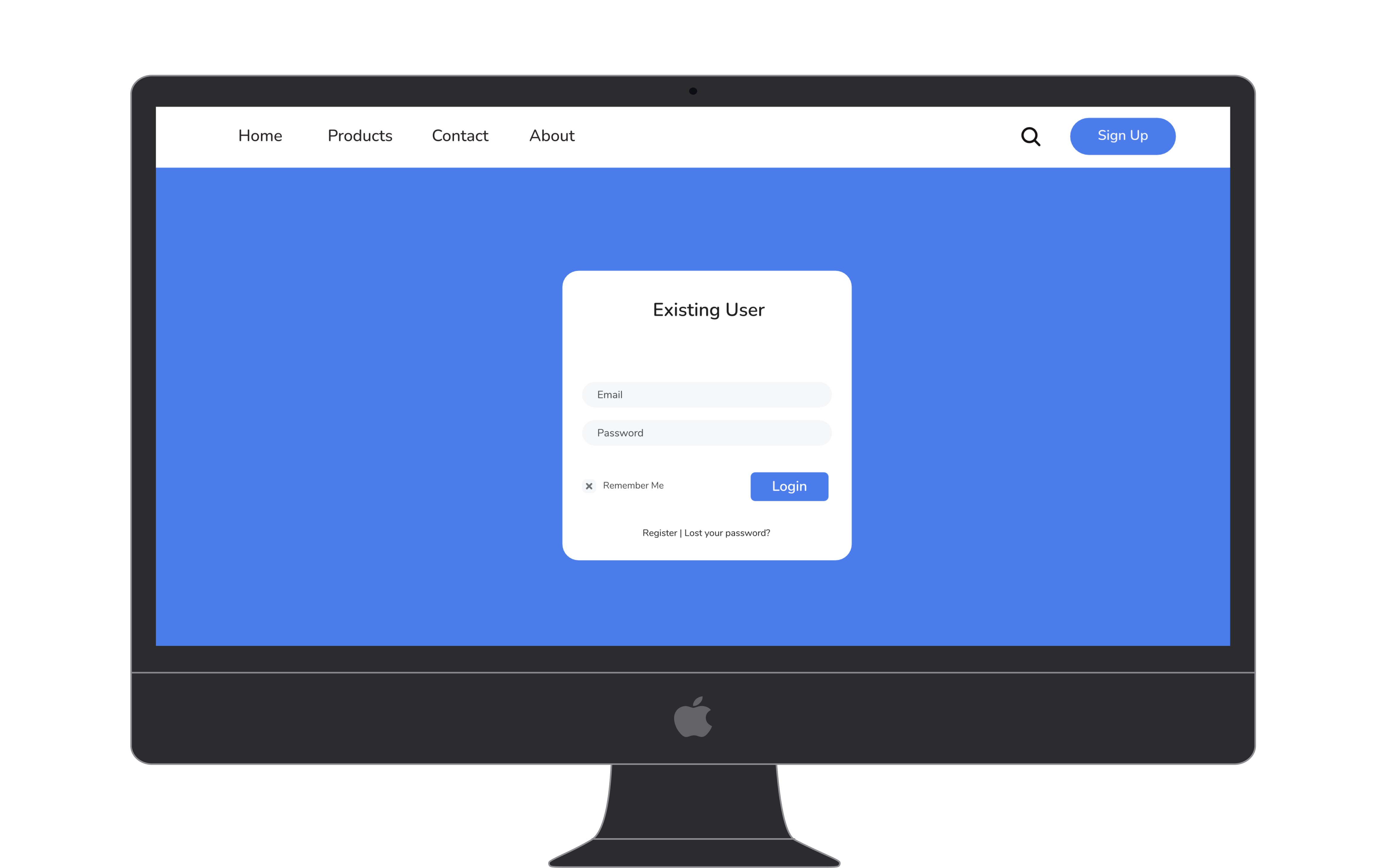
A separate visual environment for login signals the transition into a secure, credentialed workspace. The distinct treatment reinforces that document search happens inside a protected context, not a public-facing surface.
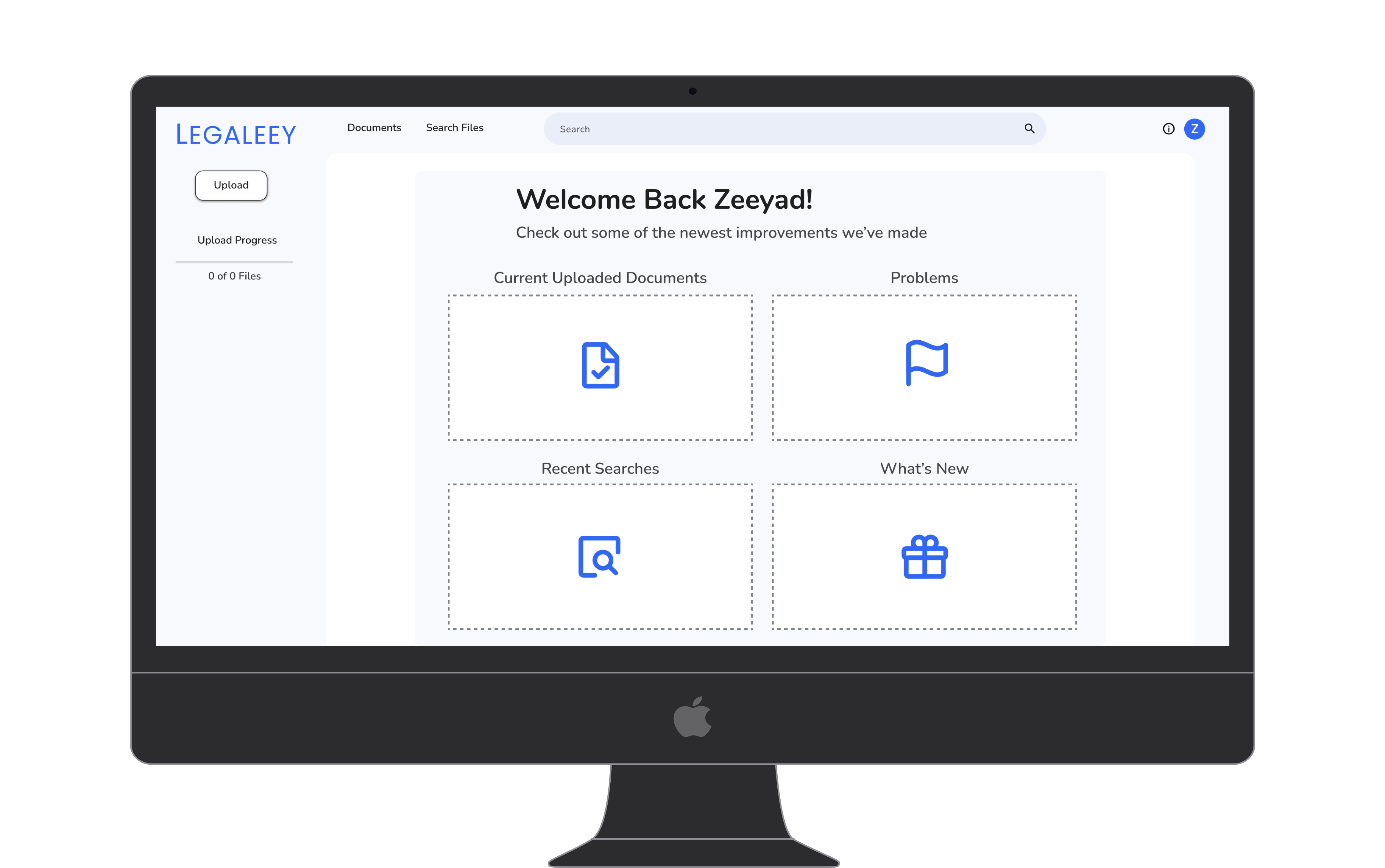
Returning users are dropped directly into their four most relevant task states, skipping any navigation step. The tile layout was chosen over a list view because lawyers returning mid-project need to act immediately, not orient themselves.
Four principles that shaped every screen
Before any wireframes were drawn, four design principles were established. Every subsequent UI decision was evaluated against them.
Avoid overloading the UI. Let the ML surface the right results. The interface should recede so the content can lead.
SERP output must be easy to read. Clear information architecture so lawyers can scan results at speed, not read them line by line.
Use standard UI elements. Lawyers are not product explorers. Friction from unfamiliar patterns destroys trust and adoption.
Contract review happens on large monitors. Design for horizontal space, keyboard navigation, and dense information displays.

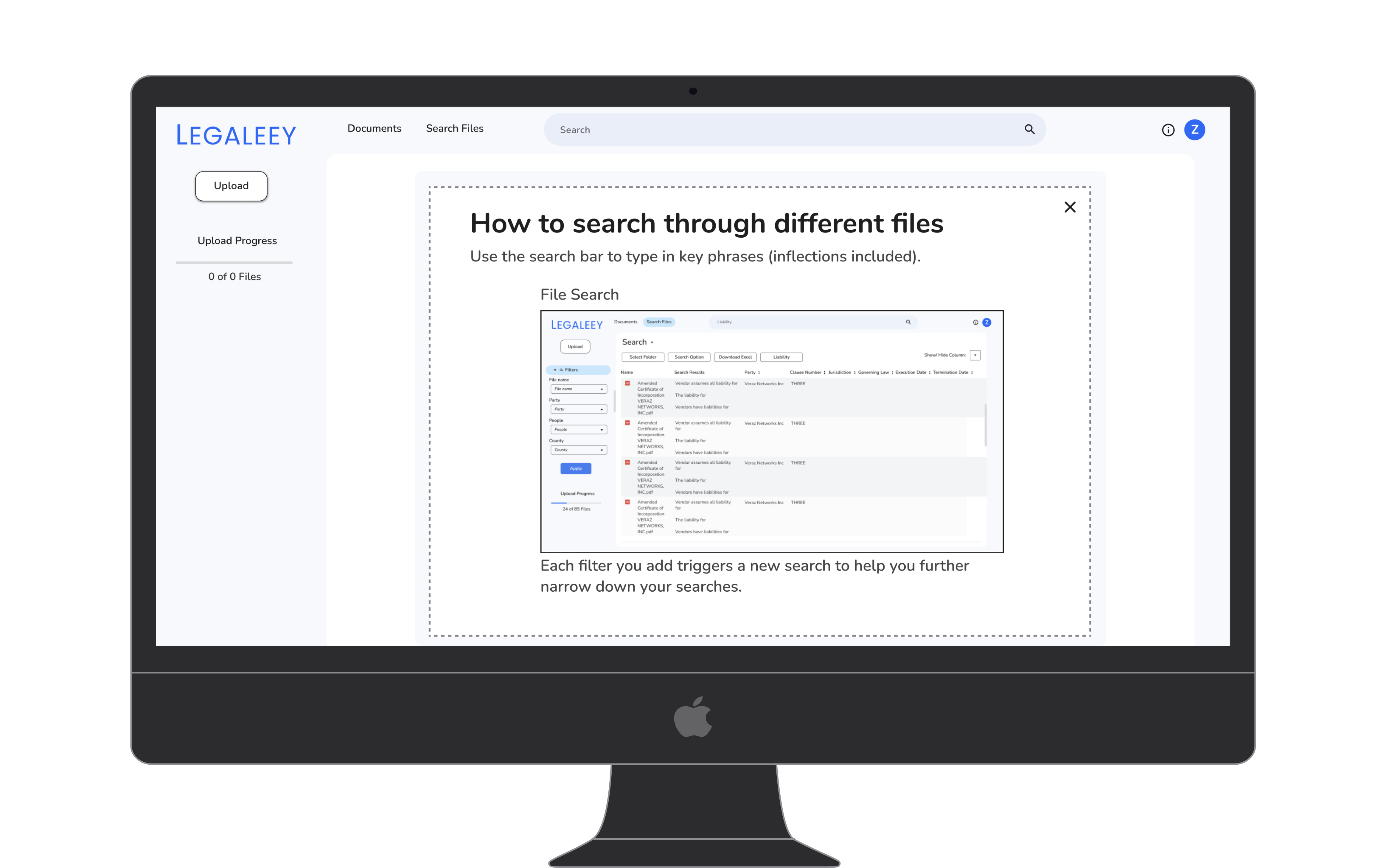
Onboarding embeds a screenshot of the actual SERP so users arrive at search with formed expectations. Showing the real interface during orientation reduces the learning curve on first use without adding a separate tutorial step.

Explaining that each added filter triggers a new search prevents users from applying all filters and waiting for a single result. This behavioral cue was added after testing revealed users were stacking filters before running any search at all.
Nine flows, end to end
The full product scope covered nine primary user flows, from first sign-up through daily document search. Each flow was designed to feel complete and self-contained, with clear feedback at every step.
-
01
Onboarding and Sign Up
Multistep flow covering email entry, password creation, phone number, and verification code. Designed to feel lightweight while gathering necessary information for account security.
-
02
First Time Dashboard
Onboarding tile layout covering File Search, Uploading, File Management, and What is New. Provides orientation without overwhelming new users unfamiliar with the platform.
-
03
Returning User Dashboard
Tiles for Current Uploaded Documents, Problems, Recent Searches, and What is New. Surfaces what matters most for a user returning mid-project.
-
04
Document Upload
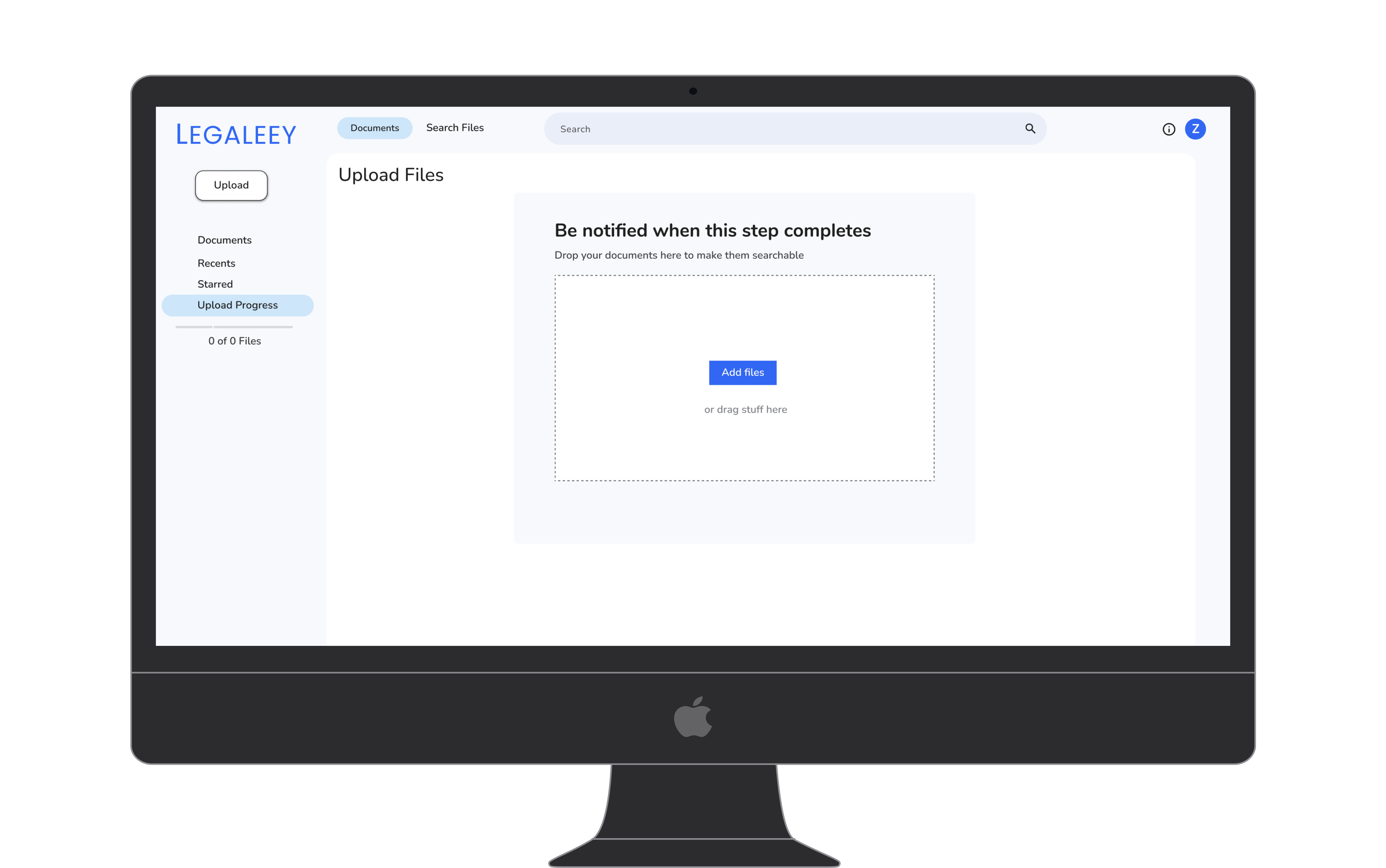
A circular drop zone creates a clear focal point, with a progress sidebar and error handling covering every upload state.
-
05
Document Management
Table view with folder and file listing, date created, last modified, and file type. Context menu with Download, Make a copy, and Delete. Filter pills for Uploaded, Verified, and Problems states.
-
06
Search and SERP
An always-visible search bar anchors every screen. A left filter panel covers file, party, date, and percentage parameters, with results surfaced in an 8-column table with Export to Excel.
-
07
Search Options Modal
Toggles for Case Sensitive, Include Inflections, and Maintain Word Order. A single-select group for Search Anywhere vs. Search Within N Words, with a number input for the distance parameter.
-
08
Search Help Modal
Boolean operator reference covering AND, OR, EXCLUDE, and Exact Phrase with concrete examples. Reduces dependence on support and builds user confidence with advanced queries.
-
09
Settings Panels
Account, Notifications with email and phone toggles for new features and upload completion, Contact Info, Sign Out, Billing, and Privacy Policy.
Embedded guidance was chosen over external documentation to keep lawyers in context during their first searches. Leaving the product to read a help article breaks the flow at the moment users are most likely to abandon.
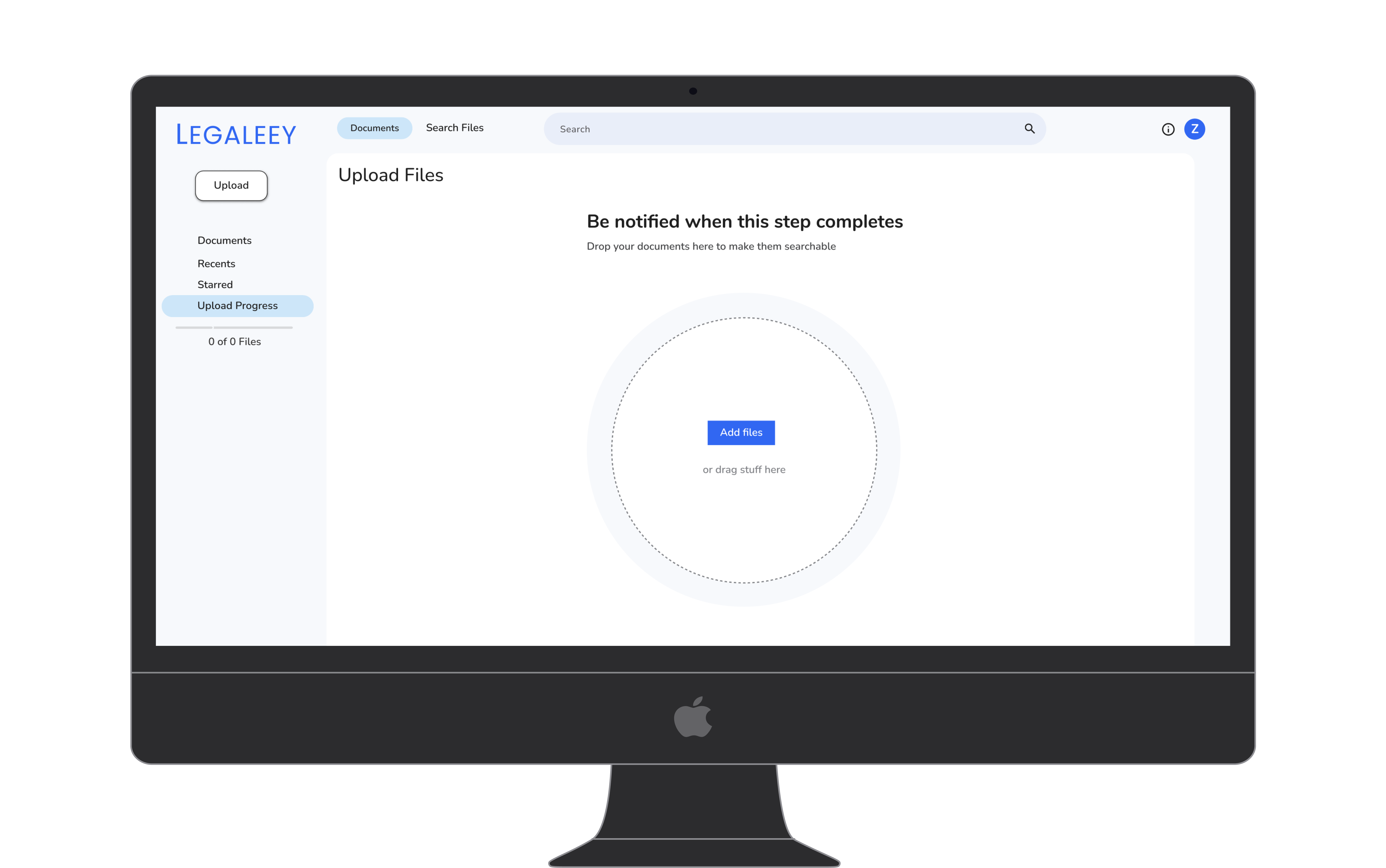
The circular focal point was chosen over a rectangular zone to reduce upload hesitation in testing. A single centered target creates a clear call to action without requiring any instructional copy.
The rectangular drop zone was the first iteration, replaced after the circular form performed better in testing. Side by side testing showed the circular variant reduced time to first upload by a measurable margin.
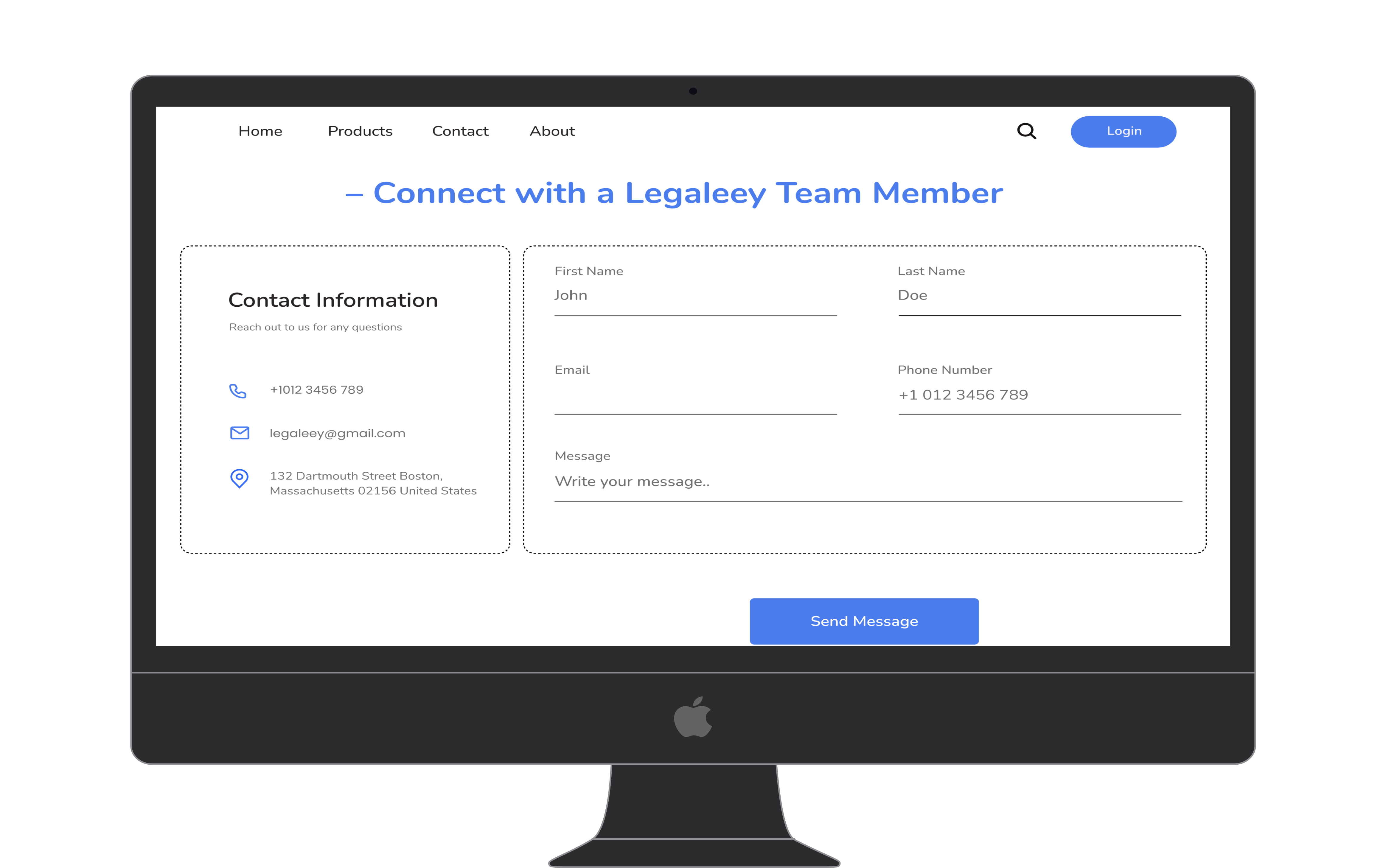
Contact access was designed into the product itself so firms could raise procurement questions without leaving the platform. Keeping evaluation and usage in the same environment lowers the barrier to first purchase.
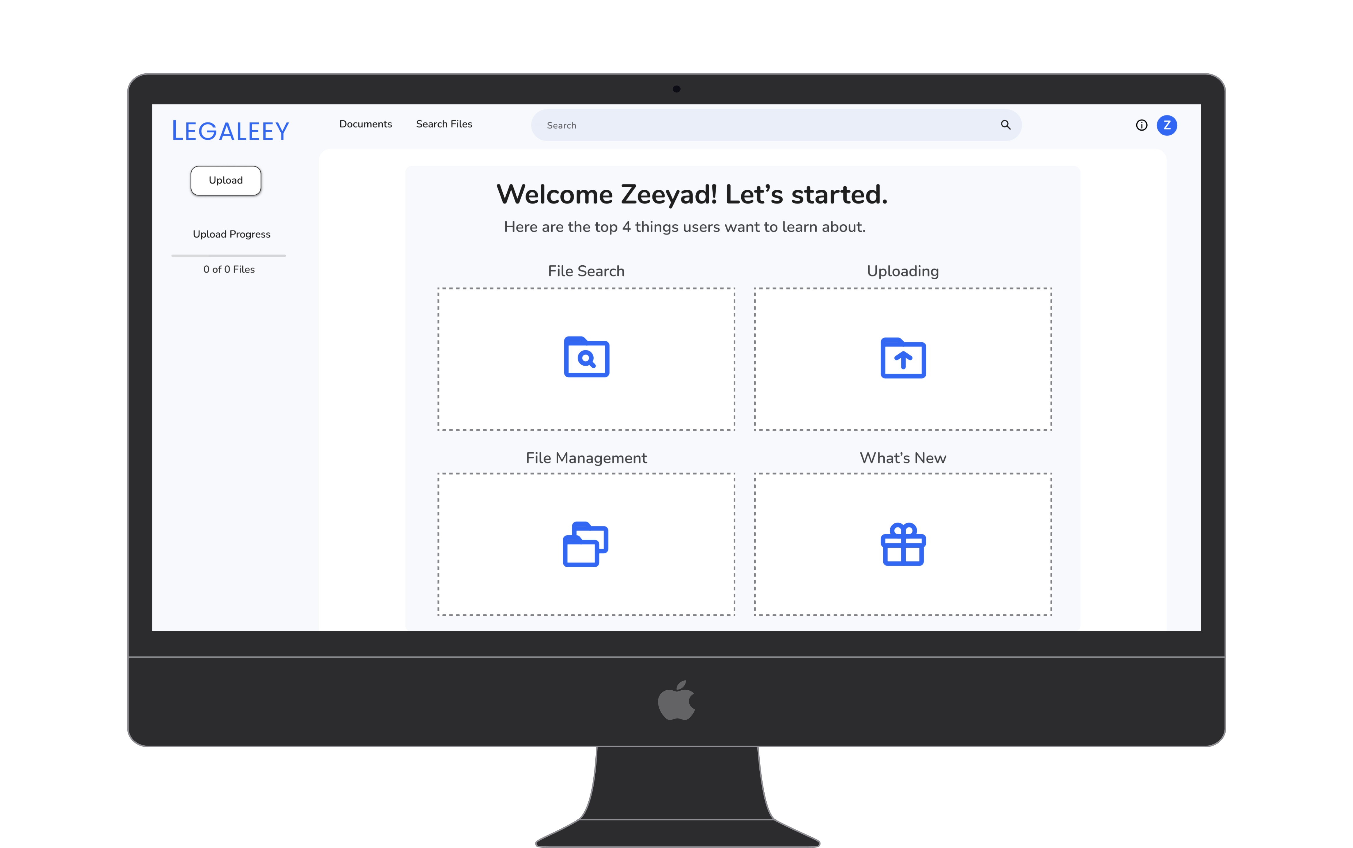
New user orientation was delivered as tiles rather than a walkthrough to lower cognitive load at entry. Walkthroughs require sequential completion and block action, while tiles let users choose their own starting point.
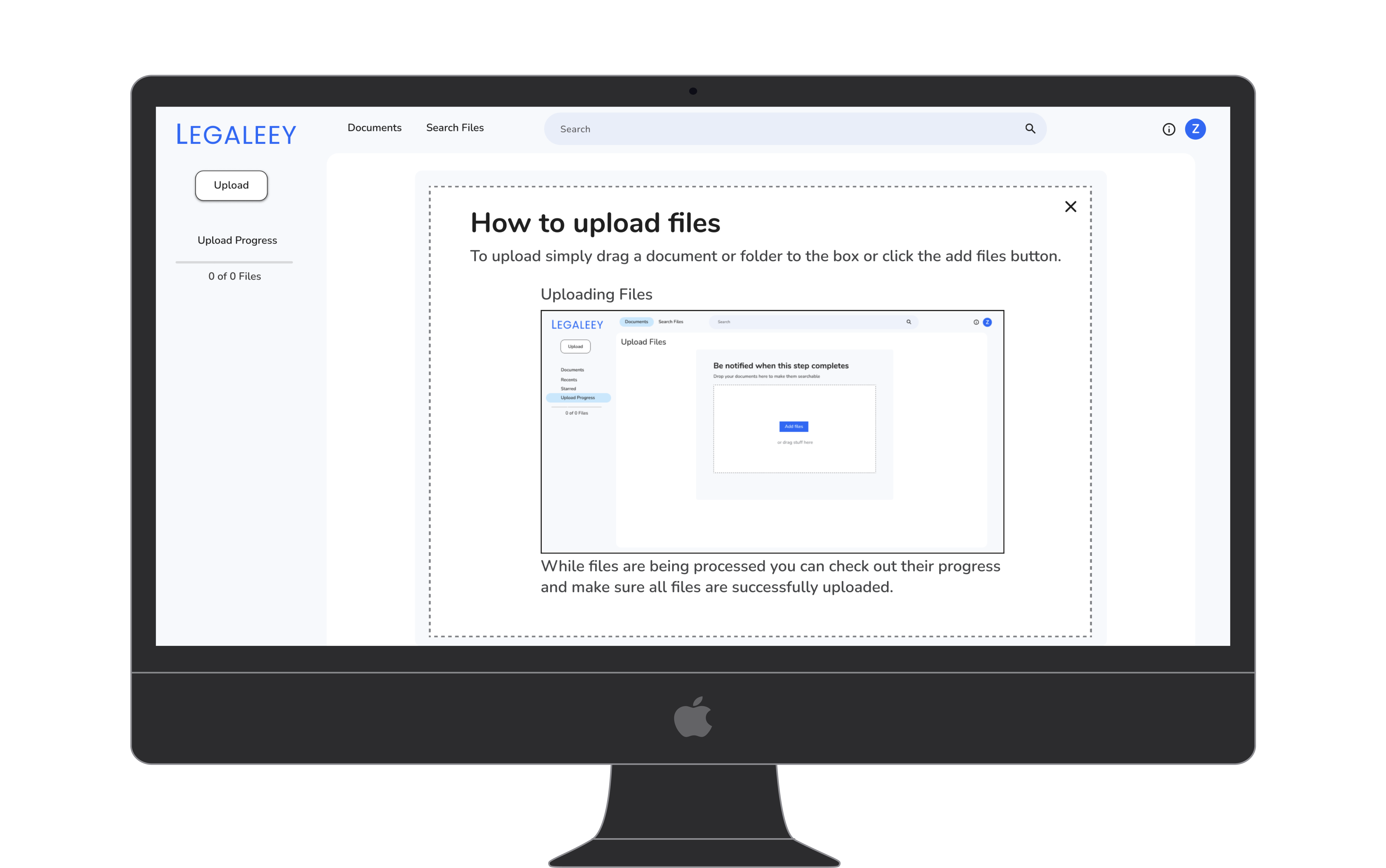
The upload tutorial embedded a live screenshot so new users could preview the interface before interacting with it. Previewing the outcome before committing to an action is a consistent pattern across all onboarding flows in the product.
Why we built it this way
Six decisions defined the character of the product. Each one was grounded in a specific user need, not visual preference.
Lawyers refine searches iteratively. Hiding filters behind a toggle forces them to interrupt their scanning rhythm every time they want to adjust a parameter. A persistent panel reduces navigation overhead and respects how legal professionals actually work.
On long filter panels, users scroll past the button. A sticky Apply keeps the action visible at all times, reducing the chance of a lawyer setting filters and forgetting to run the search, which wastes time and creates confusion.
An early version used card-based results. User feedback showed lawyers could not scan across multiple results quickly, so we switched to a table. The format maps directly to how legal professionals already process information and allows Export to Excel, which fits naturally into how findings get documented and shared within a firm.
A single, clear focal point on the upload screen reduces hesitation. The circular form creates visual hierarchy without adding text instructions. It signals: this is where the action begins.
Lawyers work across firm devices, client environments, and court facilities. A browser based platform requires no IT approval or installation and is accessible from any machine with login credentials.
Power users want advanced queries but do not always remember operator syntax under pressure. An in-product reference reduces support requests and builds confidence without requiring a separate documentation visit.
The hardest balance in this product was between simplicity for new users and power for experts. The solution was progressive disclosure: simple by default, with advanced options always one step away but never in the way.
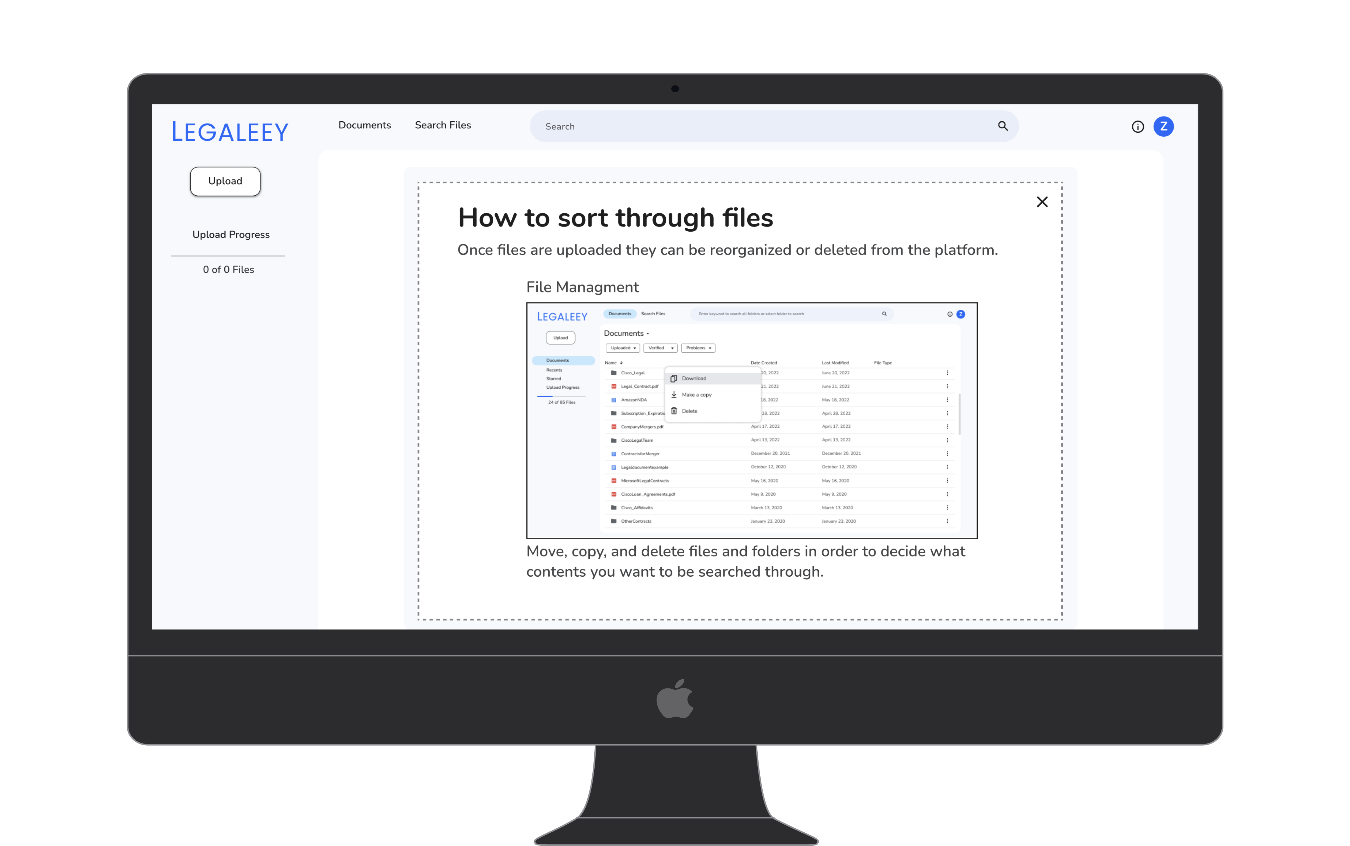
File management actions were shown in context within onboarding rather than discovered through trial and error. Surfacing the Download and Delete options early reduces support requests from users who cannot find core file actions.
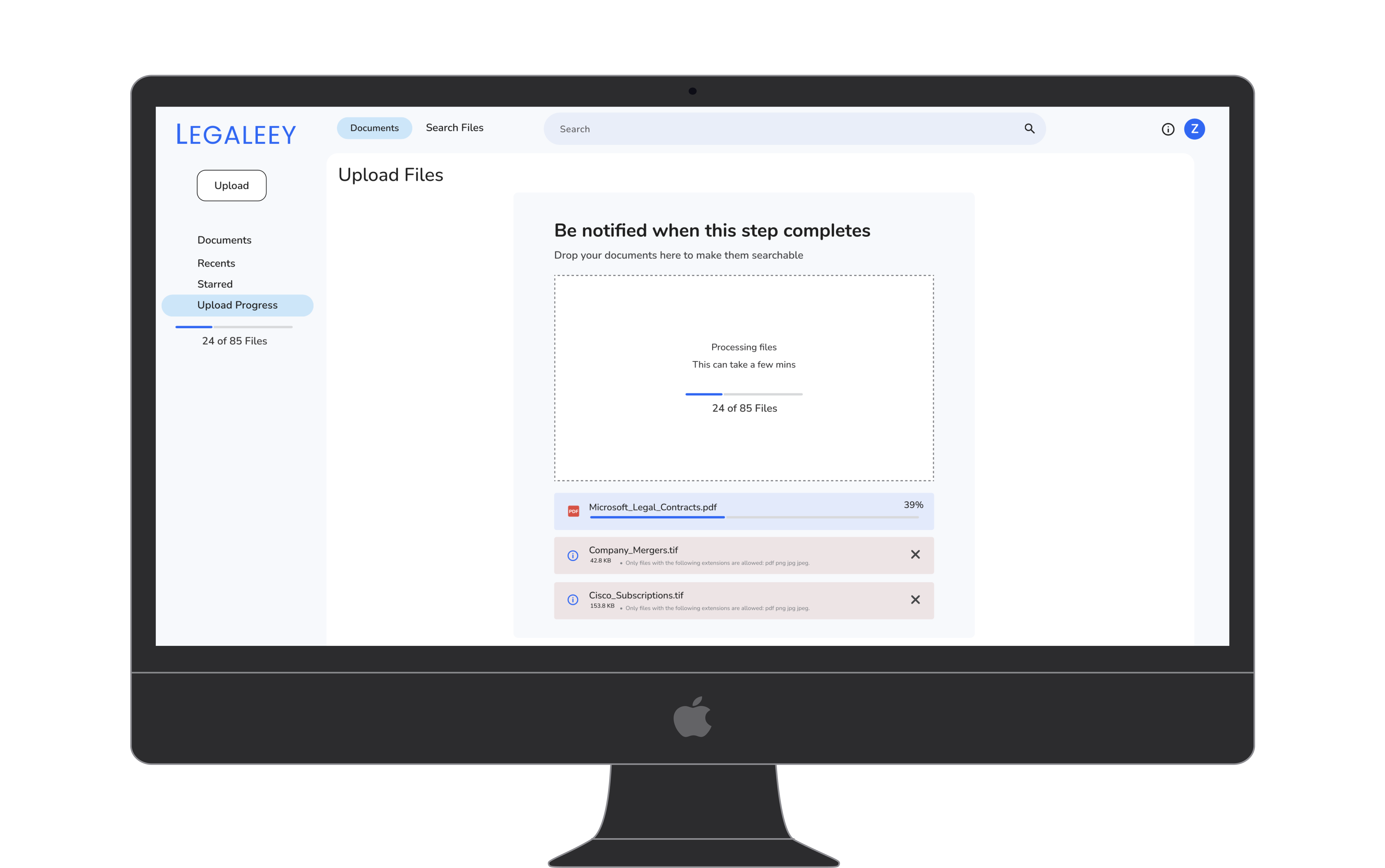
Upload status was tracked per file so lawyers could identify unsupported formats before committing to search. Per file feedback was added after testing showed users had no way to diagnose why certain documents were not appearing in results.
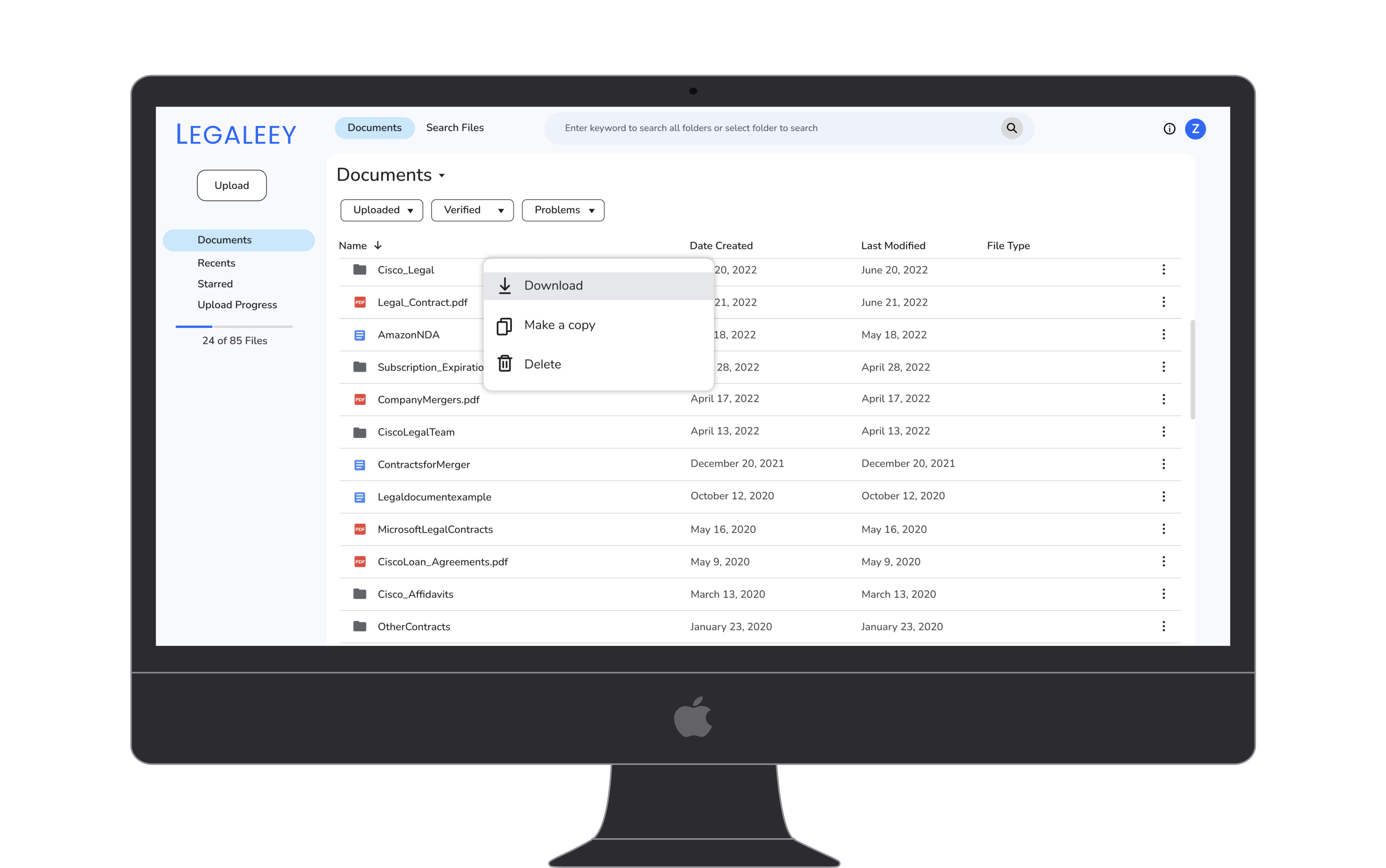
A table layout for document management mirrors the file paradigm lawyers already use in their daily workflows. Familiar patterns reduce the learning curve and increase the likelihood that new users complete their first upload without assistance.
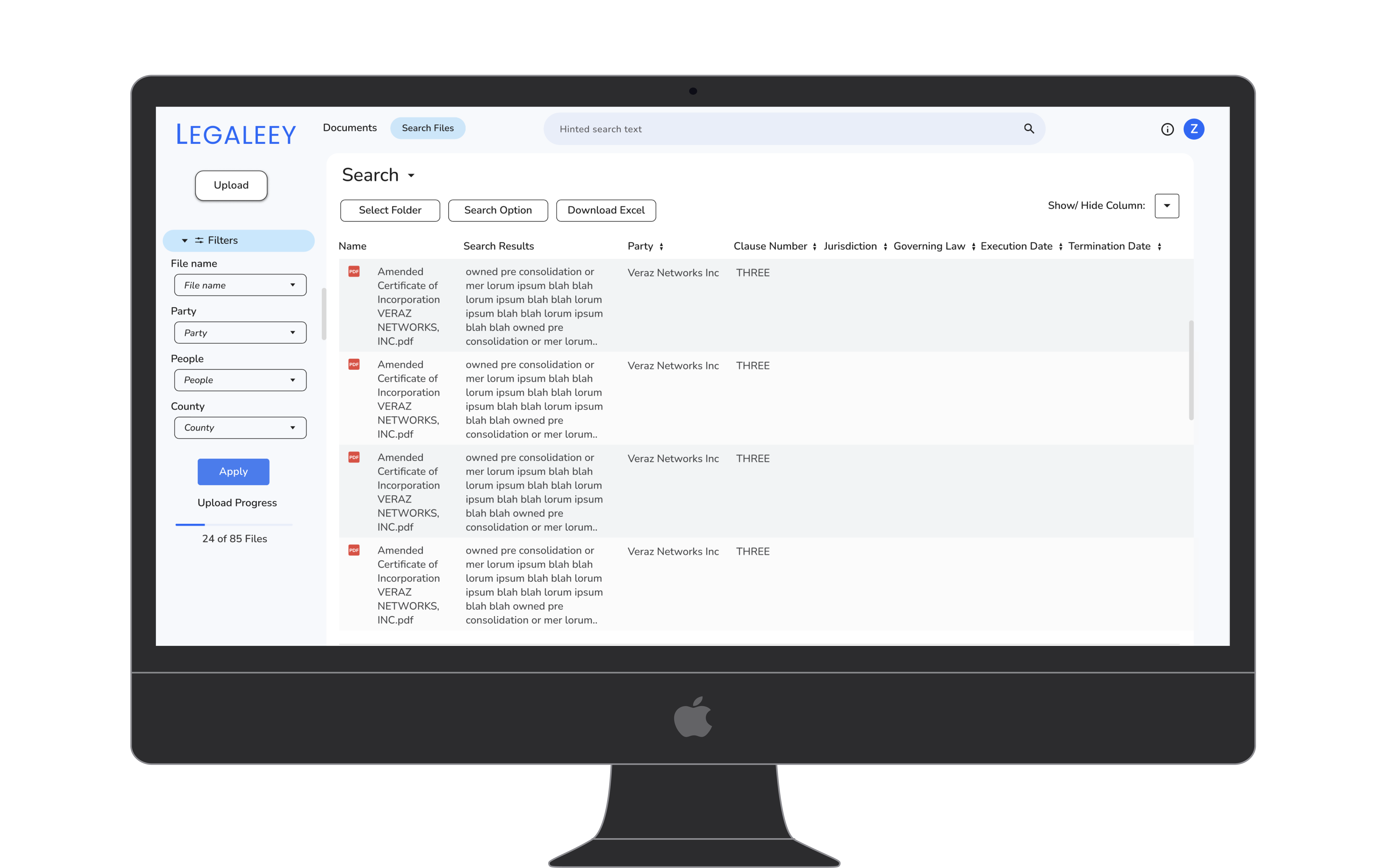
Filters for party name, people, and county map directly to how legal professionals think about clause retrieval. These categories were derived from user interviews and reflect the actual mental model lawyers use when searching across contracts.
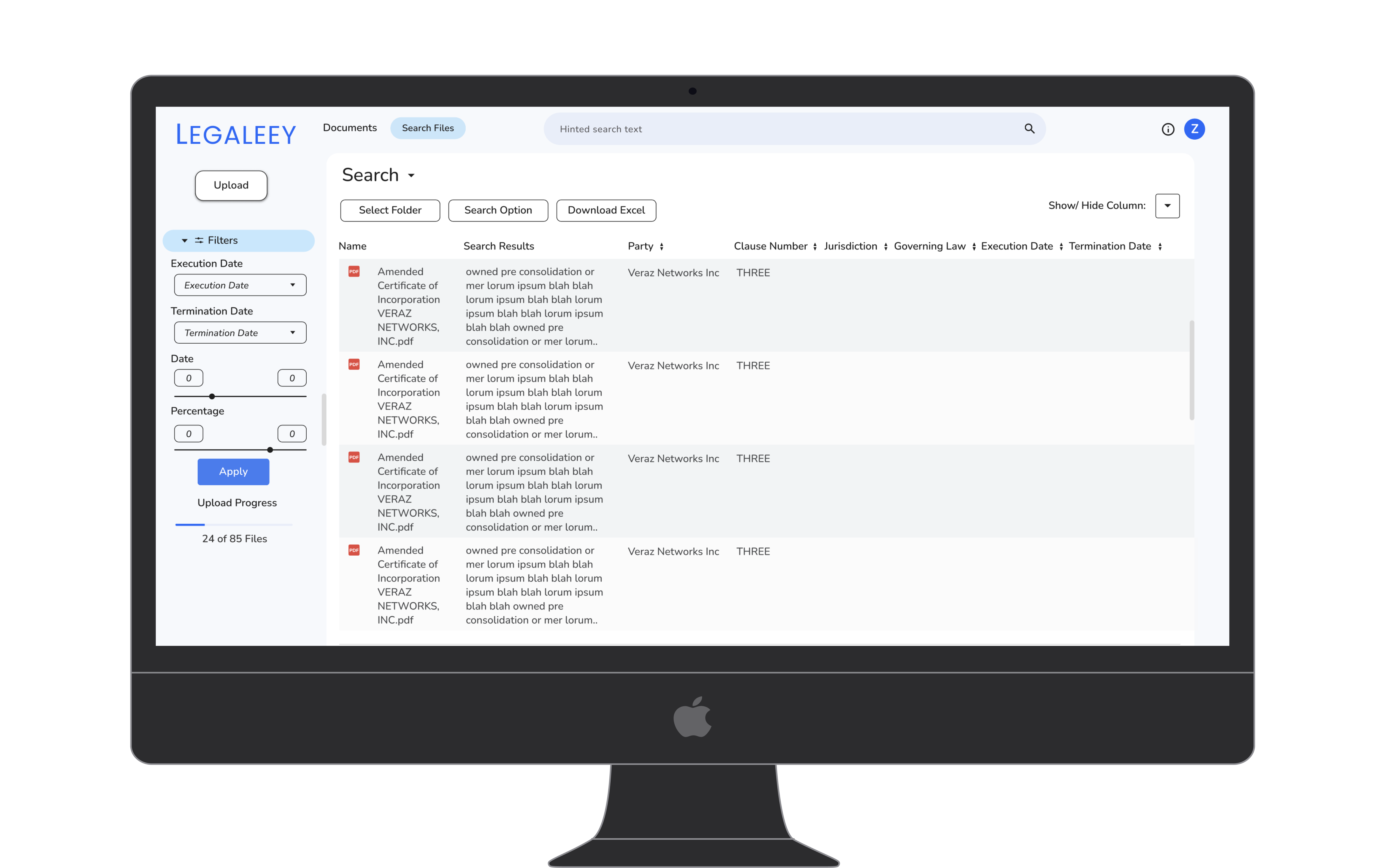
Date range and percentage filters address the most common clauses lawyers need to surface across contract portfolios. Adding sliders rather than text inputs for these fields reduced input errors and sped up filter application in testing.
Validating AI search for legal work
The demo release was used to validate product market fit with early law firm customers. The results confirmed that AI driven search addresses a real, high-priority pain point in legal practice.
Users confirmed that structured, clause-aware results were significantly more useful than raw keyword matches from Acrobat. Time to find relevant clauses dropped by over 60% compared to Acrobat in testing scenarios.
The persistent filter panel saw high engagement. Users actively used date sliders and party filters, confirming the decision to keep them always visible rather than hidden.
One of the most-used features in early testing. Lawyers immediately exported results into existing workflows, validating the table-based output format.
The drag and drop upload with real-time progress feedback received consistently positive responses. The upload flow scored the highest satisfaction rating of any flow in user testing.
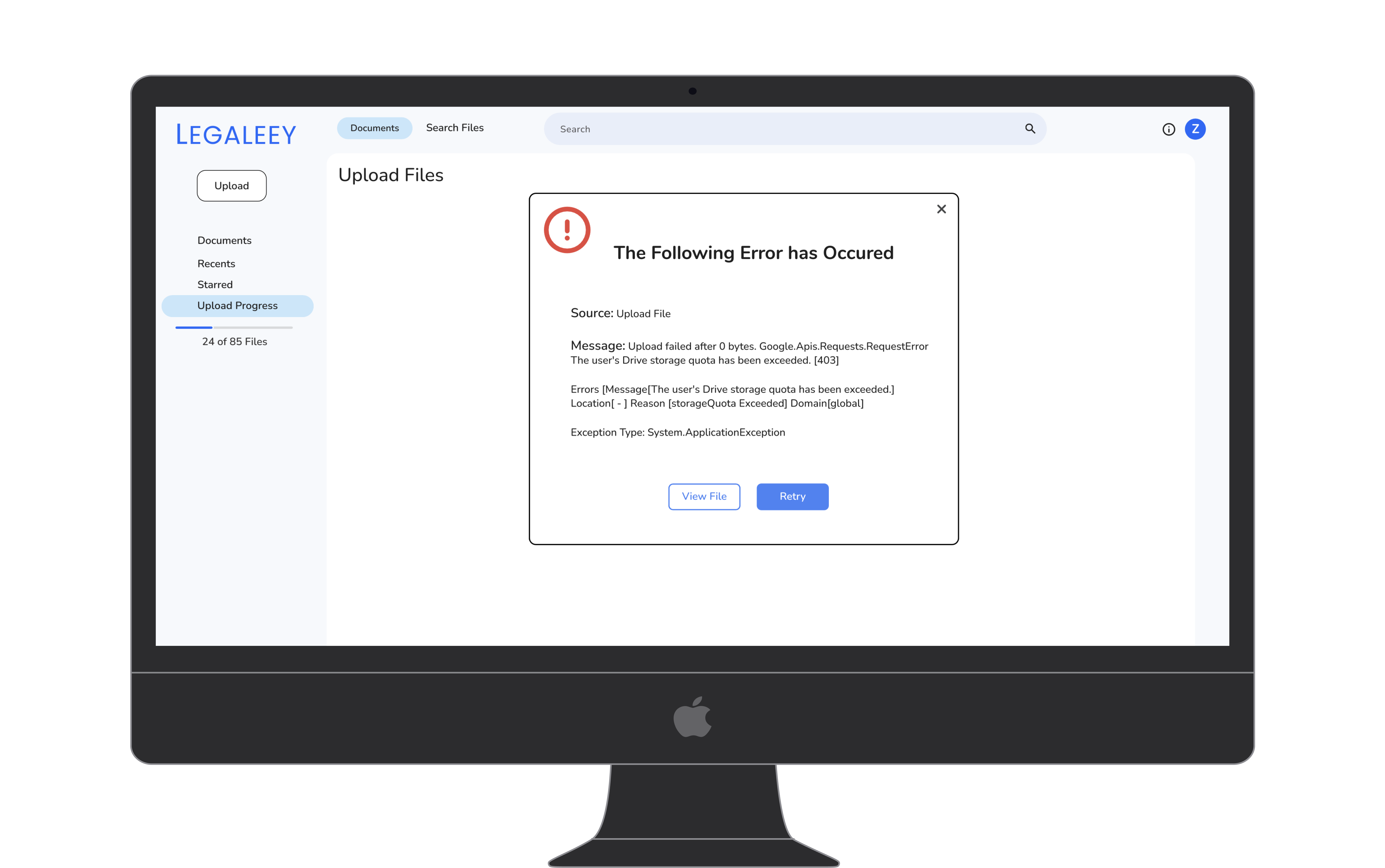
Error messages surface the specific cause and provide a recovery action rather than generic failure copy. Lawyers under time pressure need to know immediately whether an error is recoverable and what to do next.
Future Directions
Allow lawyers to annotate and tag search results directly in Legaleey, creating a persistent record of their review findings.
Surface a confidence indicator alongside each AI result so lawyers can quickly identify which findings need manual verification.
The demo validated that structured AI search output is not just useful but immediately adoptable by legal professionals when presented in familiar UI patterns. The biggest barrier to adoption was not learning curve but trust in the AI output accuracy. That finding directly shaped the next phase of design, surfacing confidence scores alongside every AI result.