At a Glance
Role: Brand and Packaging Designer, solo
Platform: Physical packaging, coffee bags
Outcome: A full identity and packaging system across four bags in one aligned template
Coffee began here
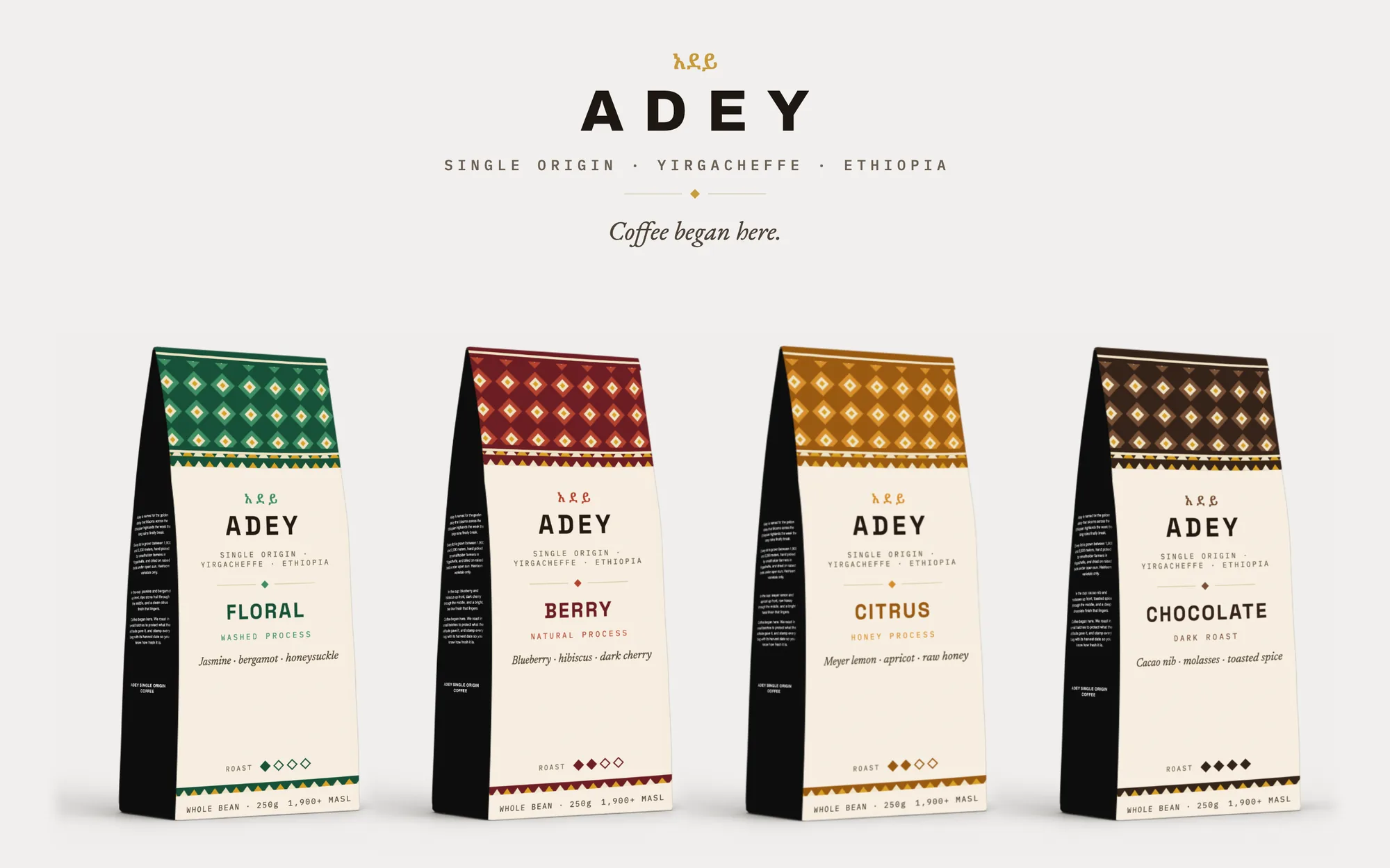
Adey is a concept brand for a single origin coffee from Yirgacheffe, Ethiopia: heirloom varietals grown between 1,900 and 2,200 meters, hand picked by smallholder farmers, dried on raised beds under open sun. The design spans the name, a bilingual identity, and a four bag packaging system where every element, from the woven pattern band to the roast scale, comes from the same visual vocabulary.
Ethiopia is where coffee was born, and most specialty packaging treats that fact as a paragraph on the back. Adey builds the brand out of it. The name is the highland daisy that marks the Ethiopian new year. The script comes first. The pattern band is woven, not printed. The origin is the identity, not a certification stamp beside it.
My Role
Brand and Packaging Designer · Naming, identity, pattern system, packaging, and flavor architecture, designed solo
Deliverables
Wordmark and bilingual lockup · woven pattern band in four colorways · four bag designs · roast and process architecture · presentation system
Named for a flower, not a farm
Adey is the golden daisy that covers the Ethiopian highlands the week the long rains finally break. It is the flower of the Ethiopian new year, the national shorthand for a fresh start, and it grows wild on the same slopes where these coffees are picked.
That name sets the brand's whole posture. Specialty coffee labels usually lead with washing station codes and lot numbers, precision that reads as authority to buyers and as noise to everyone else. Adey leads with something a person can feel: a place, a season, and the sentence that ends the origin debate before it starts. Coffee began here. Everything else on the bag exists to earn that line.
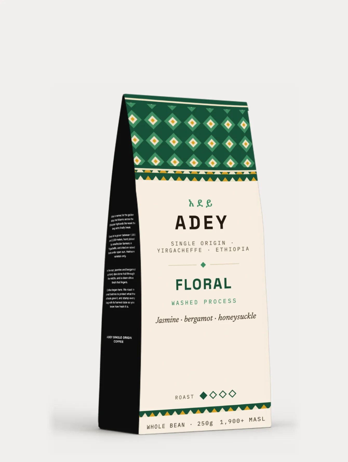
The Floral profile: washed process, lightest roast, and the green band that starts the family
A label built from three elements
Every bag is composed from the same three elements: the woven diamond band, the bilingual lockup, and a roast scale that reuses the band's own diamond as its marker. Nothing on the label is decoration only; every ornament either names the origin or carries information.
The band's diamond in diamond motif is drawn from telet, the woven borders of traditional Ethiopian dress and basketry, where geometry carries meaning row by row. On the bag it does the same double work: it is the most visible Ethiopian element on the shelf, and its colorway is the flavor code. The lockup follows the same logic as the pattern: the Amharic አደይ sits first, above the Latin, because the origin leads this brand. Below it, a single line of tracked monospace type carries the facts like a stamp on an export crate: single origin, Yirgacheffe, Ethiopia.
Named for the cup, not the process
The four profiles are named for what the coffee tastes like: Floral, Berry, Citrus, Chocolate. The process language that usually headlines specialty bags, washed, natural, honey, dark roast, still appears, but demoted to a subline. A shopper who knows nothing about processing can still choose correctly in five seconds.
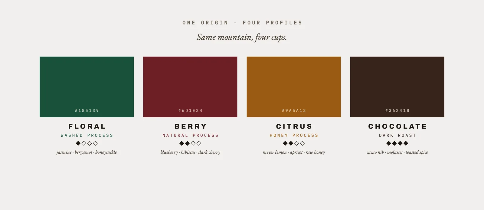
The architecture: each profile pairs a band color, a process, a roast level on the diamond scale, and three tasting notes
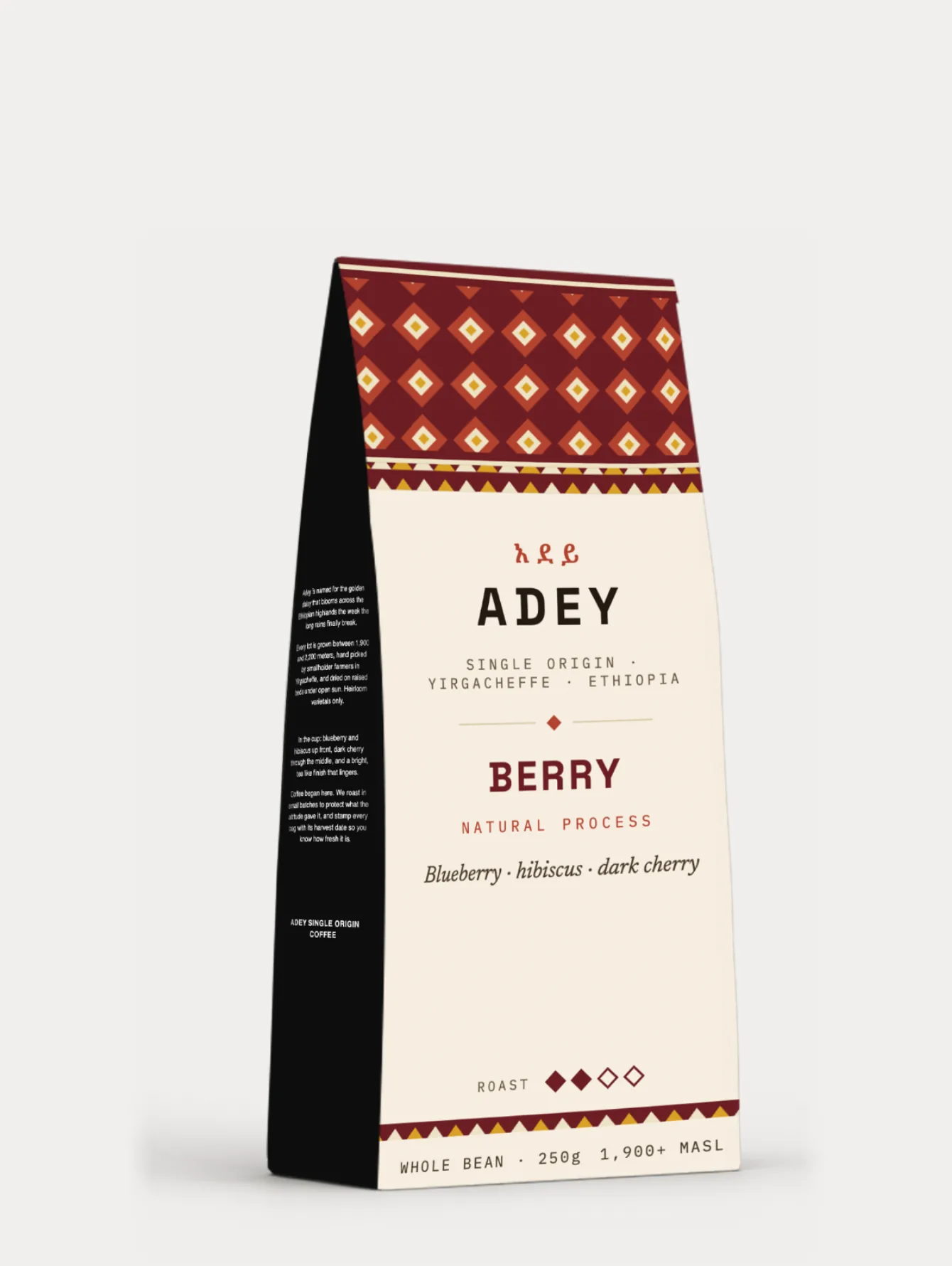
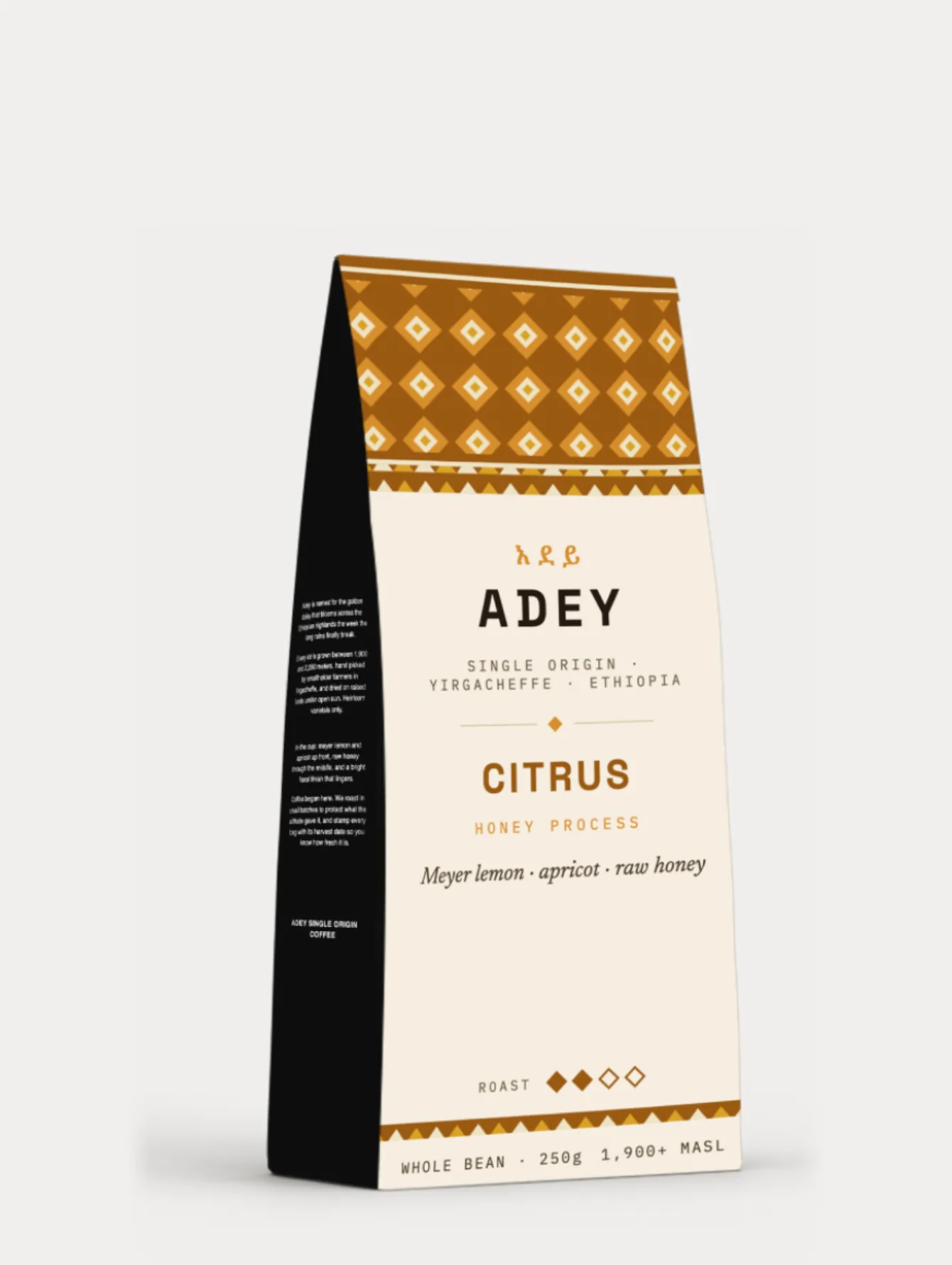
Berry in oxblood, Citrus in amber. Same template, same lockup, same baseline; only the band and its ink change
A quiet front and a talkative side
The bag splits its job in two. The cream front panel is the shelf face: lockup, profile name, three tasting notes, roast scale, and one line of facts. The black side panel is the reading face, carrying the full story, the daisy, the altitude, the farmers, the roasting philosophy, for the person who has already picked the bag up.
That split keeps the front honest. Nothing on it requires reading more than six words at a time, and the hierarchy runs exactly in the order a buyer decides: which brand, which flavor, how it tastes, how dark. The functional line at the base, whole bean, 250g, 1,900 plus meters above sea level, is set in monospace like a customs stamp, the one register where coffee is allowed to sound industrial.
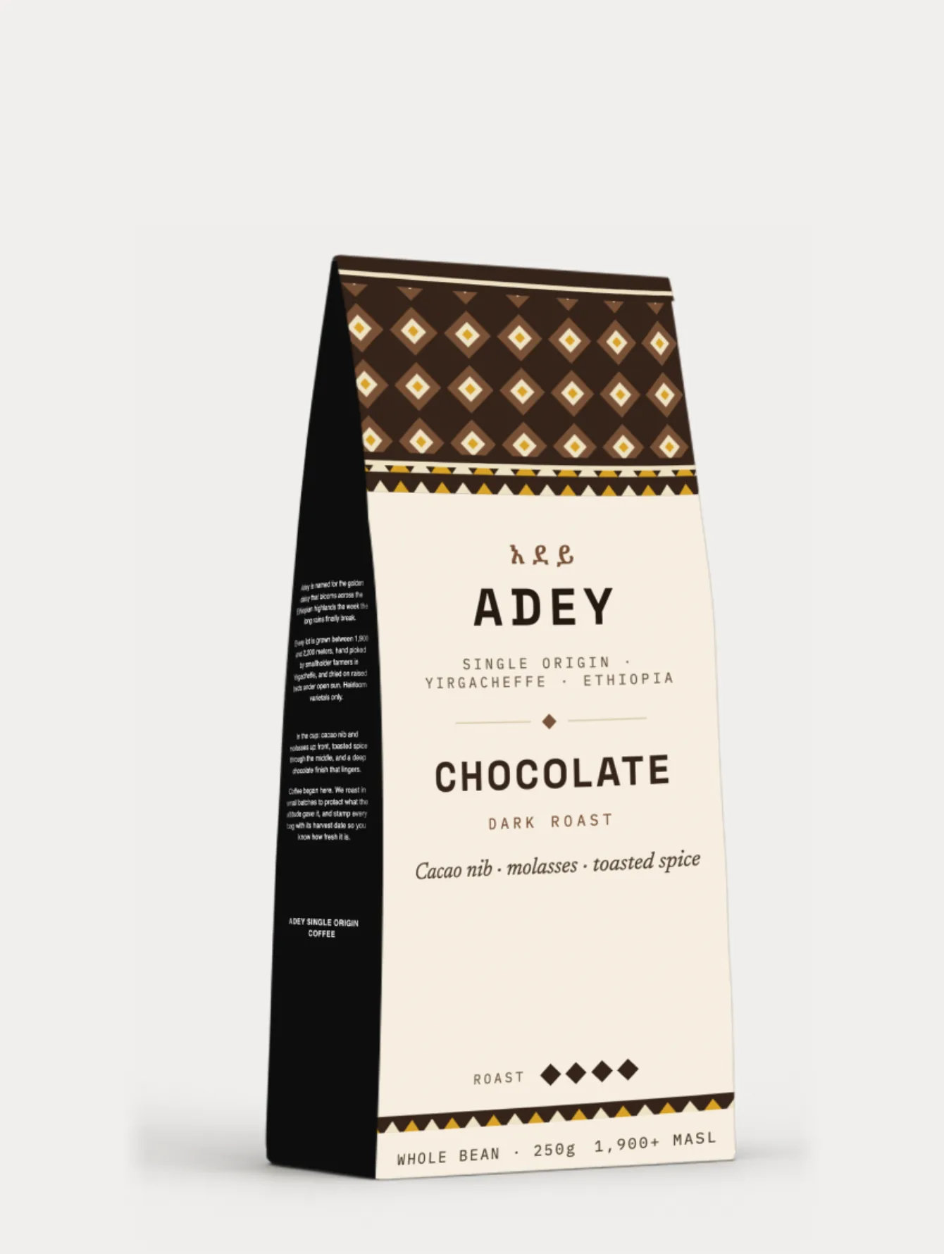
Chocolate, the anchor of the range: the darkest band, all four diamonds filled, and the same quiet front
Why Adey looks the way it does
Coffee shelves are crowded with two defaults: minimal white bags with abstract art, and heritage bags drowning in illustration. Adey argues for a third position, where every traditional element carries modern information, and each decision below trades a category habit for something the origin actually owns.
1 · The pattern is the flavor code
One woven band, four colorways: deep green for Floral, oxblood for Berry, amber for Citrus, dark brown for Chocolate. The band is the single loudest element on the bag, which means the flavor difference is visible across a cafe, not just at reading distance. And because the geometry never changes, the four bags read instantly as one family. The pattern does the work a logo usually does and the work a color system usually does, at the same time.
2 · The diamond becomes data
The roast scale is four diamonds, filled left to right: one for the lightest roast, four for the darkest. The diamond is lifted straight from the woven band above it, so the bag's most functional element and its most decorative element are the same shape. Ornament earns its place on this label by moonlighting as information, and the scale needs no words to be read in any language.
3 · Amharic first, always
The lockup places አደይ above the Latin wordmark on every bag, in the band's own ink. As with any bilingual mark, the hierarchy is the message: a coffee that claims Ethiopian origin as its whole identity should not typeset that origin as a footnote. The Latin ADEY, wide tracked and heavy, carries retail legibility; the fidel above it carries the truth of the thing.
4 · Taste words beat process words
Washed, natural, and honey are meaningful to perhaps one buyer in twenty. Jasmine, blueberry, and cacao are meaningful to everyone who has ever eaten breakfast. Naming the range for the cup, Floral, Berry, Citrus, Chocolate, moves the expertise into the subline where it rewards the connoisseur without gatekeeping the newcomer. The bag speaks flavor first and credentials second.
5 · One template, four bags, zero drift
All four bags share one fixed composition: same band depth, same lockup position, same note line, same scale, same baseline. A new profile is a colorway and a text pass, not a design project. The discipline shows most in the family lineup, where the four bags align to the pixel, and it is the practical promise a real roaster needs: seasonal lots can join the range without touching the system.
The smaller calls that add up
The long copy, the naming story, the altitude, the roasting philosophy, lives on a black side panel in small white type, like a chalkboard in a cafe. Splitting the talkative surface from the shelf surface lets the front stay quiet without silencing the brand.
The label ground is a warm cream, not printer white. Against it the band colors read as dyed thread rather than screen ink, and the whole bag sits closer to paper, basket, and cloth, the material world the pattern comes from.
Weight, format, and altitude are set in monospace, the typography of shipping stamps and lot cards. It separates verifiable fact from brand voice at a glance, and it nods to the export crates this trade actually moves in.
The small gold triangles in the band border repeat in all four colorways, the daisy's color woven through the whole range. It is the one constant in the variable element, the same role the brand name plays in the system.
A range that scales without a redesign
Adey shipped as a complete concept: name, bilingual identity, a woven pattern system in four colorways, four packaged profiles, and a flavor architecture that maps process and roast to language any buyer understands. The presentation on this page was rebuilt for consistency: the mockups were rendered at different scales and croppings, so every image here was recomposed on one grid, with the four bags matched in size and baseline to within a pixel.
Heritage elements survive on a modern shelf when they are given jobs, not frames. The woven band is the flavor code. The diamond is the roast scale. The script is the hierarchy. Nothing traditional on this bag is displayed like an artifact, and that is exactly why none of it reads as costume.
What I Learned
Adey sharpened a rule I now apply everywhere: decoration that carries information cannot be cut, and decoration that carries nothing eventually will be. Every ornamental element on the bag survived design review because it was doing double duty. The project also proved the template discipline again, four bags aligned to one grid make each other stronger, and the same is true of the images that present them.
The pattern codes flavor, the diamond measures roast, the script sets hierarchy. Every traditional element earned its place by carrying modern information.
Floral, Berry, Citrus, Chocolate is a menu anyone can order from. Expertise belongs in the subline, where it deepens trust instead of blocking the door.
The four bags differ by one color decision each. Everything else is held, and the holding is what makes the family read as a brand rather than four labels.
Inconsistent renders undersold a consistent system. Rebuilding every image on one measured grid was the same discipline as the template itself, applied to the case study.