At a Glance
Role: Design Engineer, designed and built solo end to end
Platform: Browser only React application
Outcome: Shipped: seven invariants enforced by tests, nothing ever leaves the device
Seven invariants, then the code
Appeal Kit walks a person from a denial letter to a mailed appeal in six steps: what kind of denial this is, which rules apply to their plan, what the real deadline is with the arithmetic shown, what evidence that denial type needs, and a letter assembled only from facts they entered. Everything runs and stays in the browser. There is no server, no account, and no analytics.
This project began differently from anything else I have built: before writing code, I wrote seven invariants into the project rules, things like a wrong deadline in this app costs someone their appeal rights and the user asserts the facts, the tool structures them. Every engineering decision in this case study is one of those sentences turned into a mechanism: a lint rule, a type, a test, or a visible badge. The invariants are not documentation. They are the product.
My Role
Design Engineer · Designed and built the entire product solo: the invariants, the deadline engine, the interface system, the tests, and the demo pipeline
Stack
React · TypeScript strict · Vite · Tailwind v4 · zustand · Dexie over IndexedDB · pdf-lib · Vitest and Playwright
1  No PHI leaves the browser.
2  The user asserts the facts. The tool structures them.
   This is the line between a document-preparation tool and
   the unauthorized practice of law.
3  Never write law, deadlines, or code definitions from memory.
   A wrong deadline in this app costs someone their appeal rights.
4  No medical advice, ever.
5  Letter generation is deterministic and template-first.
6  Deadlines are computed, shown with their arithmetic, and sourced.
   Never round, never guess, never display a bare date.
7 Being routed away from an appeal is a valid, good outcome.See it work
A walkthrough of the full flow: classifying a denial, watching the deadline derivation compute itself, gathering evidence, and assembling the letter with every sentence traced to its source.
Appeal Kit walkthrough: triage, the deadline derivation, evidence, and the provenance tinted letter
The letter says no. The clock is already running.
A health insurance denial arrives as a dense letter full of codes, and the person reading it is frightened, possibly sick, and has just been told no by an institution. Most people do not appeal at all, even though appeals frequently succeed. The ones who try face three traps at once: a deadline they do not know, evidence requirements they cannot guess, and a letter they have never written before.
There is a fourth trap hiding underneath: many denials are not appeal problems at all. A claim rejected for missing information is the provider's resubmission to fix. A deductible working as designed is not appealable. A tool that funnels every denial toward a letter would waste exactly the time these users do not have. And everything the tool touches is protected health information, which rules out the standard playbook of servers, analytics, and accounts before the first line of code.
Get a frightened non expert from a denial letter to a filed appeal with the right evidence, before the deadline, without a single byte of their health information leaving their own device?
The voice rules in the project doc answer the emotional half of the problem: write like a competent friend who has done this before, hedge where the law hedges, and never offer reassurance the tool cannot back up, because unearned comfort reads as untrustworthy. The engineering answers the rest.
Six steps, one case file
The interface is built to feel like a well made government form: a docket rail on the left, flat paper sheets, squared corners, and monospace type for anything the user must transcribe exactly. The design brief banned every generic default and sourced the visual language from the paperwork itself: ledger, docket, receipt, stamp, copy.
Start and coverage
The first screen makes the privacy promise in plain words and lists what to have in hand. The second asks just two questions, where the coverage comes from and how the plan is funded, because those two answers decide which laws, deadlines, and regulators apply. Answering I do not know is a first class option, and the tool defaults conservatively while telling the user exactly what to confirm.
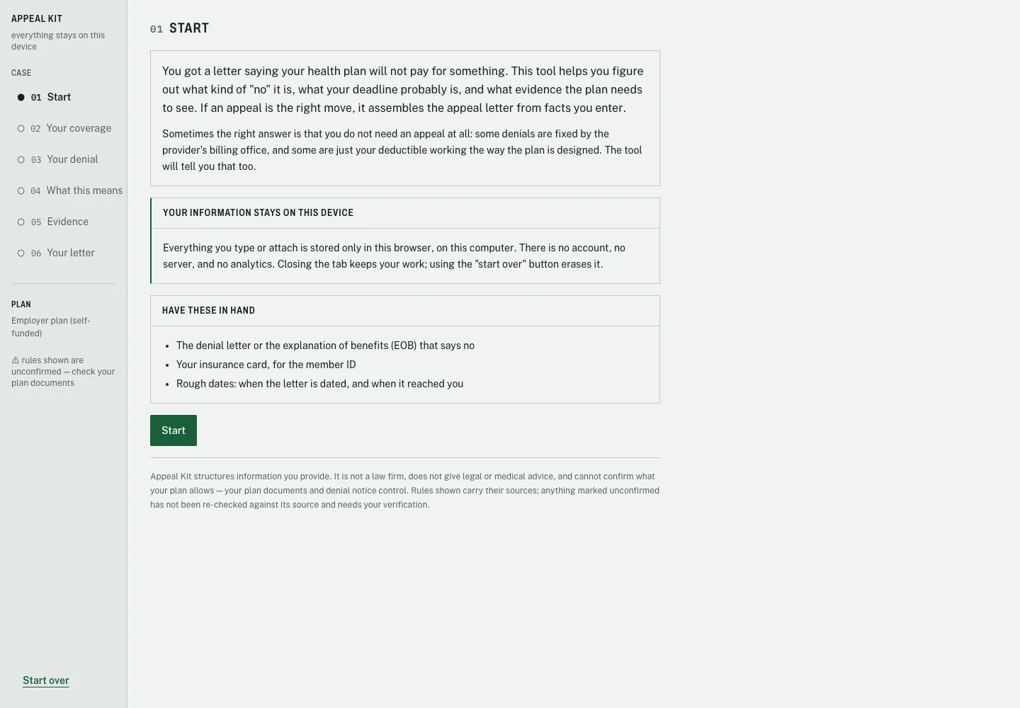
The first screen leads with the privacy promise: no account, no server, no analytics, and start over erases everything
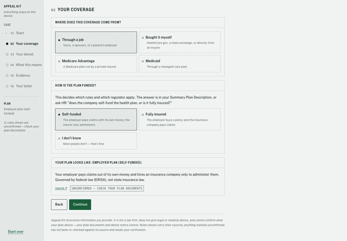
Two questions resolve the plan type, and with it the rulebook. The I do not know option says what most people need to hear: that is fine
The denial, transcribed exactly
The denial step is built around transcription. The reason code field, the dates, and the quoted denial reason are all set in monospace, a deliberate signal that says copy this exactly. The tool asks for the reason word for word because the appeal letter quotes it back to the plan, and a paraphrase would weaken the user's own case.
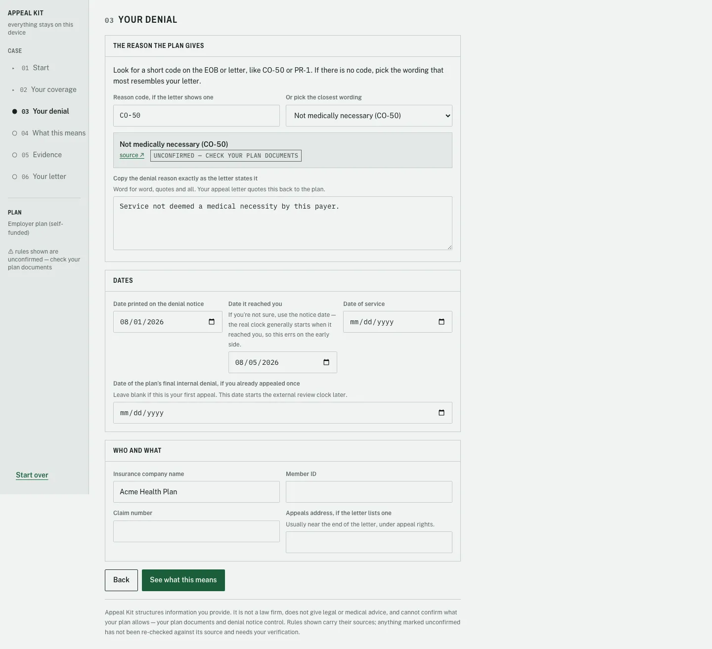
The received date hint encodes a legal judgment: when unsure, use the notice date, because erring early is the safe direction for a deadline
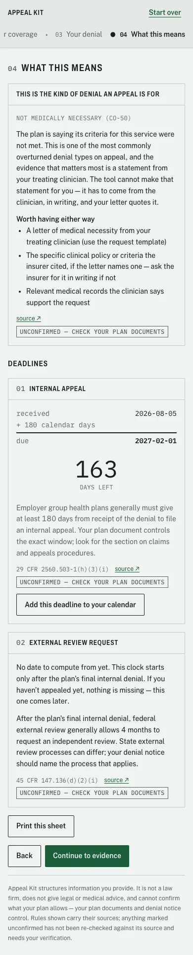
What this means
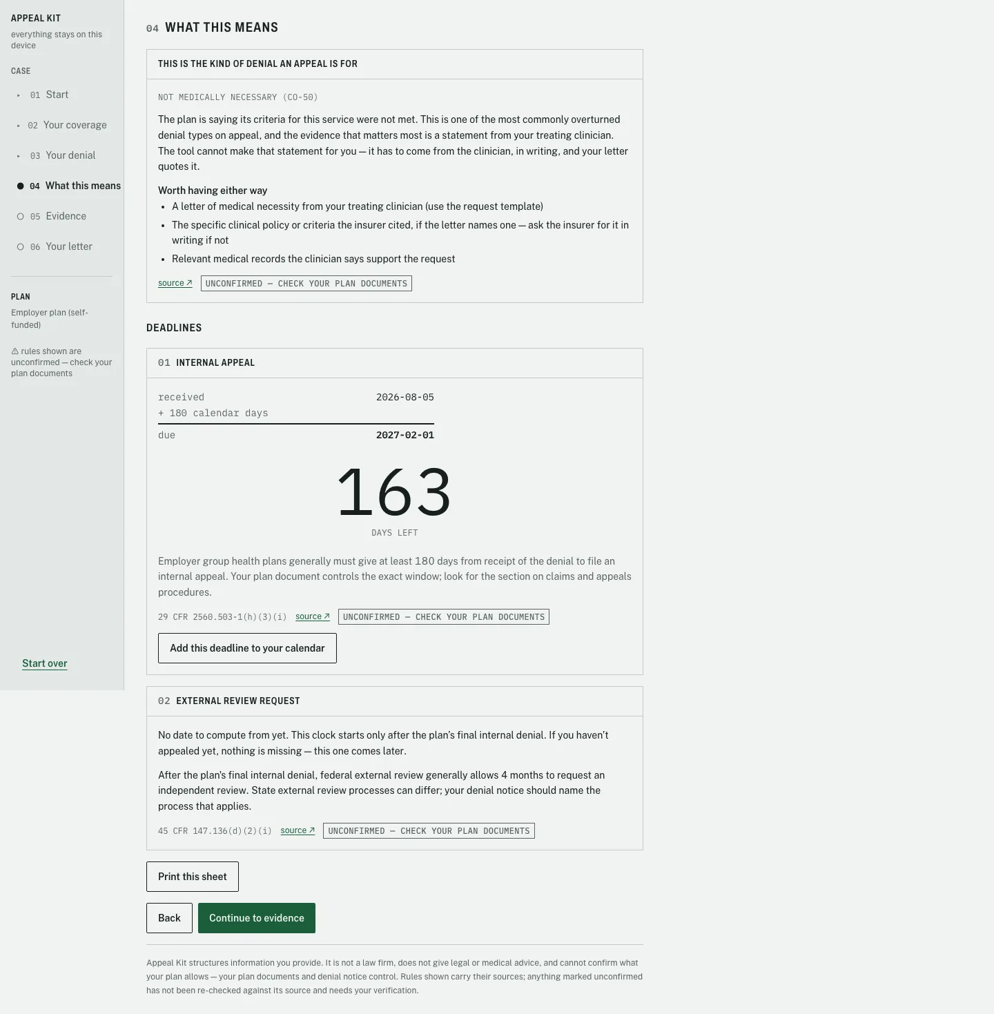
The triage screen is the product's centerpiece. It names the denial type in plain language, says what evidence matters most for it, and then shows every applicable deadline as a worked derivation: the anchor date, the addition, a drawn rule, the due date, and a days remaining counter set at 96 pixels in monospace. Beneath every rule sits its federal citation, a source link, and an unconfirmed badge wherever the content has not been re verified against its source.
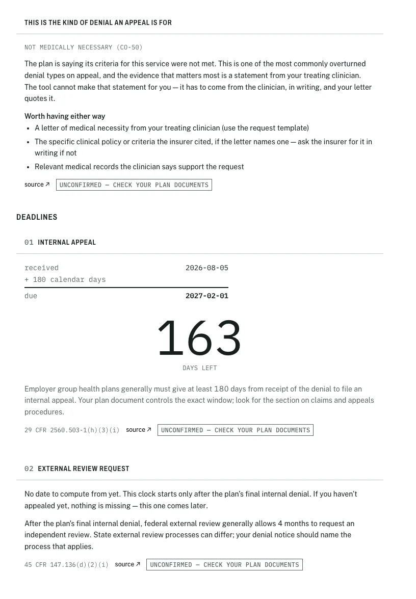
The deadline sheet prints as a plain document, because a date on paper taped to a fridge outlives any browser tab
Evidence and the letter
Evidence is a checklist keyed to the denial category, plus a ready to send request for a clinician letter, because for medical necessity denials the clinician's written statement is the evidence that matters most and the tool refuses to fabricate it. Attached files stay in the browser and get a SHA 256 fingerprint. The letter step then assembles everything into a document where every span of text is tinted by its origin: plain for template scaffolding, yellow for what the user typed, pink for what they quoted from an attached document.
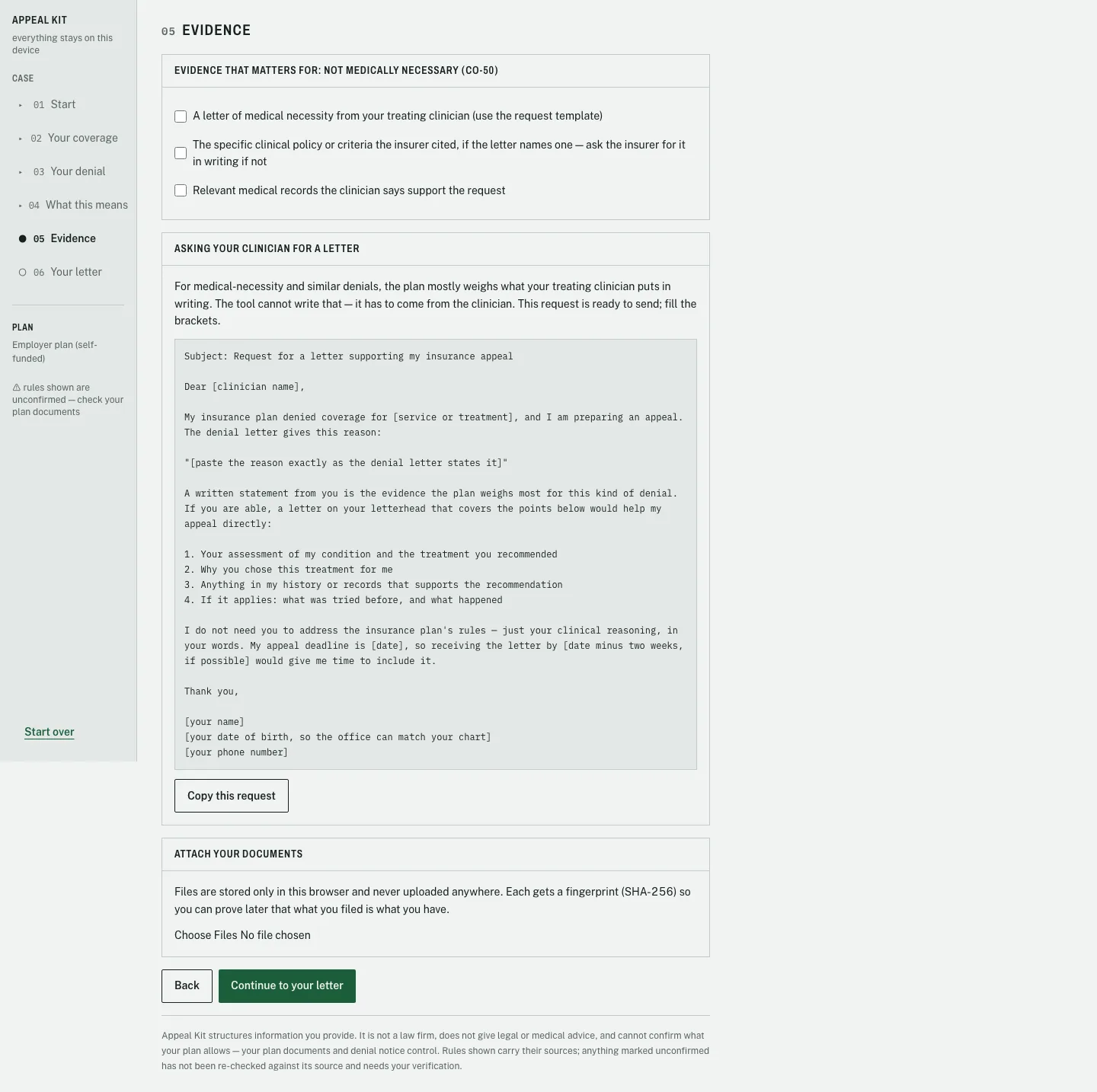
The clinician request template does the hardest ask for the user, and stops at exactly the line the tool must not cross
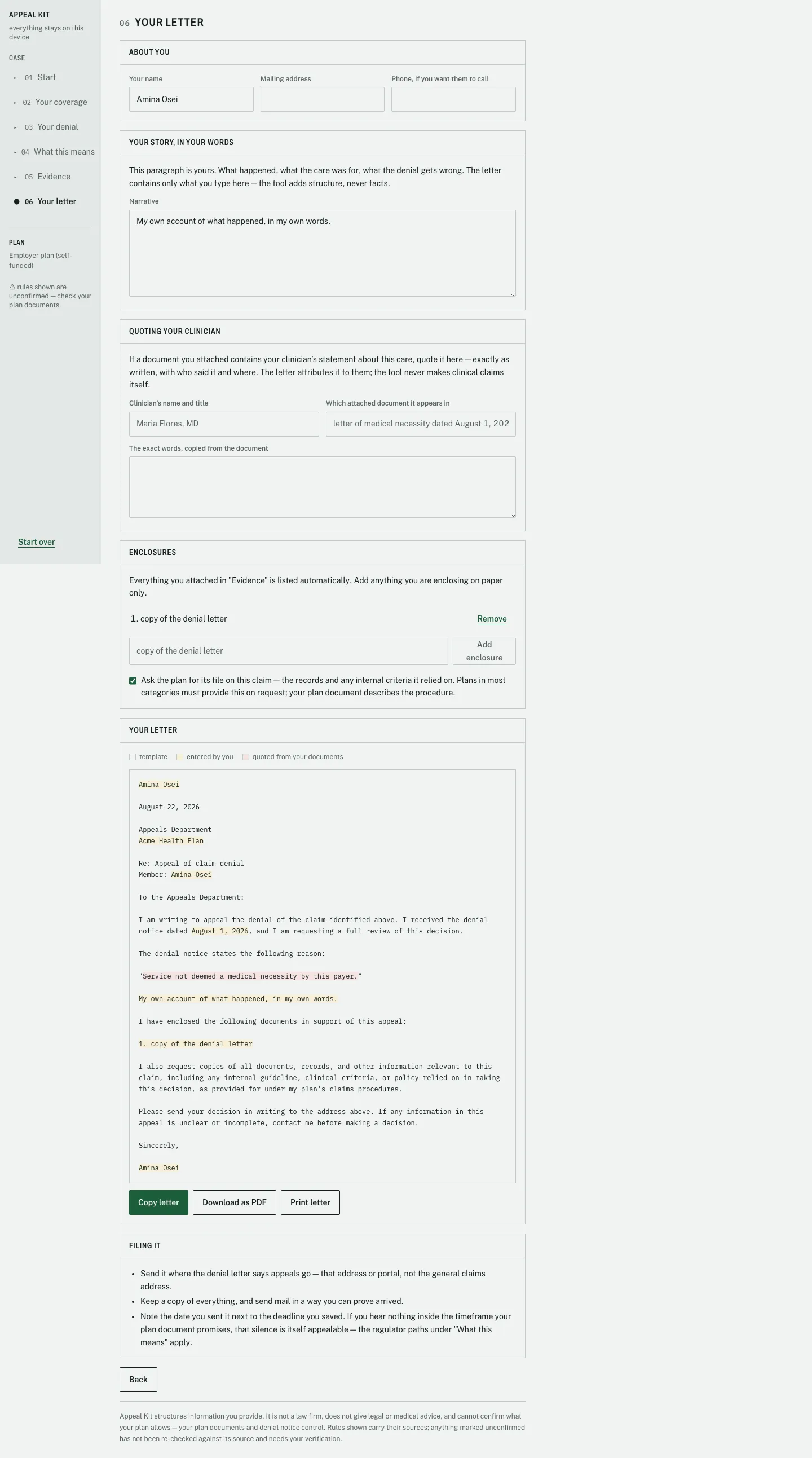
The carbonless triplicate view: one letter, three origins, each visible. The legend reads template, entered by you, quoted from your documents
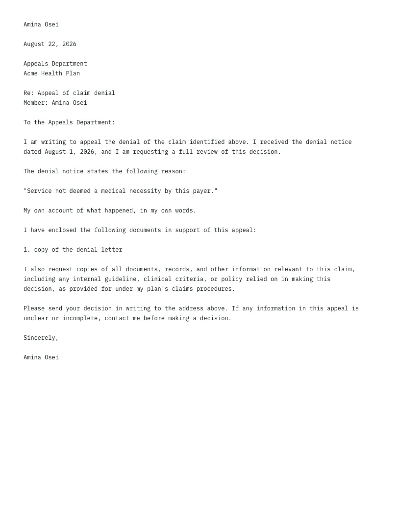
The mailed letter prints with every tint stripped, because the color coding is a working aid, not part of the filed document. The same screens hold at phone width
A domain layer that cannot touch the world
The codebase is split so the risky logic is the pure logic. Everything that computes deadlines, classifies denials, or assembles the letter lives in a domain layer with zero React imports and zero I/O, enforced by lint rules and by running the unit tests in a plain Node environment where a DOM import would fail loudly.
domain/        pure logic, zero React imports, zero I/O
  deadlines/   the deadline engine
  triage/      plan type + denial category classification
  letter/      provenance-tagged block assembly
features/      React feature modules (network calls banned by lint)
content/       versioned JSON data, every entry carries its source
lib/           storage, pdf, ics, crypto, the only wall-clock read
ui/            four primitives + nine color tokens
There is deliberately no router. The current step lives in the store, not the URL, which means no health information can ever leak through browser history, referrer headers, or a copied link. Persistence is a zustand store pointed at a small hand written adapter over Dexie, so everything the user types lands in IndexedDB on their own machine, and the start over button wipes both tables in one transaction.
All legal content lives in versioned JSON where every entry must carry three fields: a source URL, a verified flag, and the date it was last checked. The letter itself is assembled from blocks and slots with no conditionals beyond presence and no randomness, which is what makes it testable to the byte.
Even the demo respects the architecture. The seeded demo case computes its dates relative to today so the deadline counter always reads 16 days left on any recording day, but the engine itself has no clock override. The comment in the seeder says it best: move the data, not the clock. There is no test hook that could ship and lie to a real user.
Turning promises into mechanisms
Anyone can write a privacy policy or a disclaimer. The engineering work in Appeal Kit was making each promise mechanically true: enforced by a type, a lint rule, a build step, or a test, so that breaking the promise requires visibly deleting the mechanism.
1 · Ship the uncertainty on the surface
Invariant three forbids writing law from memory, so every deadline rule, denial category, and regulator entry in the content files carries a source citation, a verified flag, and a last checked date. Here is the honest part: all 22 seeded entries currently ship with verified set to false, because the citations were written down but not yet re read from their sources. Instead of hiding that, the interface says it everywhere: an unconfirmed badge beside every rule, a warning in the docket rail, and a disclaimer in the footer.
/** Every content entry carries its provenance. Invariant 3. */
export interface SourcedEntry {
  id: string;
  source: string;
  verified: boolean;
  lastChecked: string;
}
Most products would have shipped these rules silently and looked more finished. Shipping them flagged is the better product: the user is told, three times per screen, that their plan documents control the real answer. And flipping any entry to verified has a defined cost, written in the README: fetch and read the source that day, then update the date. Honesty became a workflow.
2 · A deadline must not depend on your timezone
The deadline engine is 98 lines, and most of its decisions exist to defeat the four ways a date can lie. Dates parse through a strict gate: a regex that rejects anything but ISO format, a UTC date class so all arithmetic runs on UTC calendar fields, and a reality check that catches impossible dates. A person computing a deadline in one timezone must get the identical answer as a person in any other, on either side of daylight saving.
/**
 * Parse a yyyy-MM-dd string as a UTC calendar date. Throws on anything else.
 * Returns a UTCDate so all date-fns arithmetic downstream runs on UTC fields —
 * a deadline must not change with the host machine's timezone or DST.
 */
export function parseIsoDate(iso: string): UTCDate {
  const match = /^(\d{4})-(\d{2})-(\d{2})$/.exec(iso);
  if (!match) throw new Error(`Expected a yyyy-MM-dd date, got "${iso}"`);
  ...
  if (Number.isNaN(date.getTime())) throw new Error(`Not a real date: "${iso}"`);
}
Two subtler calls sit around the parser. First, the wall clock is read in exactly one 14 line file, and it reads the user's local calendar, because a person at 6pm should see their own date. Every calculation after that runs on UTC. Second, today is always a parameter of the engine, never read inside it, which is what makes the whole engine deterministic and testable without fake timers.
3 · Never display a bare date
Invariant six says deadlines are computed, shown with their arithmetic, and sourced. The engine enforces that by construction: the computation returns the arithmetic as a field, a full sentence naming the anchor, the addition, the result, and the citation, so no consumer can display the date without the derivation being available in the same object. The same sentence travels into the calendar export, so the reasoning survives even inside a calendar app two months later.
const arithmetic =
  `${displayDate(anchorIso)} (${ANCHOR_LABELS[rule.anchor]}) ` +
  `+ ${rule.amount} ${unitWord} = ${displayDate(dueDate)}, per ${rule.citation}`;

// e.g. "March 3, 2026 (the date you received the denial)
//       + 180 days = August 30, 2026, per 29 CFR 2560.503-1(h)(3)(i)"
The design brief argues this is where the product earns its identity: the one loud element in a deliberately quiet interface is a large monospace counter above its own derivation, and as the brief puts it, no one else would build it, because it only makes sense if you have committed to never displaying an unsourced date.
4 · Carbonless triplicate: provenance as a type
Invariant two is a legal boundary: the tool structures facts but never asserts them, which is the line between document preparation and practicing law. That sentence became a type with three values. Every span of the assembled letter is tagged template, user, or quoted, the letter preview tints each origin like the white, yellow, and pink sheets of carbonless paper, and the print stylesheet strips the tints so the mailed letter is a plain document.
/**
 * Where a piece of letter text came from — the carbonless-triplicate model:
 * template scaffolding, the user's own entries, or words quoted from a
 * document. This is the enforcement surface for invariant 2: anything not
 * 'template' must trace to a slot the user filled.
 */
export type Provenance = 'template' | 'user' | 'quoted';

/** Unmapped slots default to 'user' — the safe over-attribution. */
That last comment is the design in four words. If a future slot is ever left unclassified, the letter attributes it to the user, which can only ever under claim the tool's authorship. The failure mode is humility. A unit test locks the other direction too: the user's name must never appear in a template tagged segment. And the plain text letter is derived from the same tagged segments, joined, so the preview, the clipboard, and the PDF cannot disagree by construction.
5 · Four layers of nothing leaves this browser
The privacy invariant is enforced at four independent layers, so removing any one of them still leaves three. Lint bans the network primitives across the entire source tree, including the two most people forget: the beacon API that survives page unload, and service workers that could proxy requests past every other check. The production build injects a content security policy that includes a rule almost nobody sets, forbidding form submission entirely, which closes the oldest exfiltration channel on the web. Fonts are self hosted so not even a font request leaks timing to a CDN. And the referrer policy makes sure that clicking a source link never tells a law site which denial page the user was reading.
// Invariant 1: no PHI leaves the browser. Network primitives are banned
// across src/**; there is nothing in this app that should talk to a host.
{ name: 'fetch',          message: 'No network calls. Invariant 1.' },
{ name: 'XMLHttpRequest', message: 'No network calls. Invariant 1.' },
{ name: 'WebSocket', ... }, { name: 'EventSource', ... },
{ selector: "MemberExpression[property.name='sendBeacon']", ... },
{ selector: "MemberExpression[...][property.name='serviceWorker']", ... }
6 · Being routed away is the tool working
Invariant seven required the humility to build a main feature and then route people away from it. Three lines of domain code decide whether a denial is an appeal problem at all, and one boolean reshapes the entire triage screen: deadlines are suppressed, the tone flips to certified green because this is good news, and the button relabels itself to continue anyway.
/** True when this category's route means "you likely do not need an appeal letter". */
export function isNonAppealRoute(category: DenialCategory): boolean {
  return category.route === 'provider-resubmission'
      || category.route === 'cost-sharing'
      || category.route === 'coding-review';
}
The judgment call is in what is missing from that list: a plan exclusion check still leads to deadlines, because a misapplied exclusion is exactly what appeals are for. A missing information rejection is the provider's fix. A deductible is the plan working as designed. Encoding that distinction is worth more to the user than any letter template, because it is the difference between a fast phone call and a wasted month.
The smaller calls that add up
Most people with employer coverage do not know how their plan is funded. The resolver defaults to self funded because both employer branches share the same 180 day appeal window, and it returns an assumed flag alongside the answer so the interface must keep hedging in three places. The difference that remains, which regulator can help, is surfaced as a note to confirm, never hidden.
Reason codes are normalized on both sides of the comparison, so co 50, CO50, and a bare 50 all match, and the content files carry bare number aliases because a person squinting at a crowded benefits statement may only see the digits. An unknown code is a soft landing, not an error: pick the closest wording instead, the letter builder works either way.
The motion policy permits exactly two transitions, each justified in a comment: the counter's shift when a case crosses an urgency threshold, and a small settle when a checklist item resolves. Everything else changes state instantly, because a person scanning for a date under stress is not an audience for ambient motion. Both respect the reduced motion preference.
Red and green is the worst pairing for the most common form of color blindness, and this product serves people who are unwell. Every urgency state pairs its color with a weight change, an explicit text label, and a fixed position in the derivation, so a user who cannot distinguish the hues loses nothing. The stamp red is rationed to two uses in the whole product.
Tests that make the invariants falsifiable
The test suite is shaped by the same priorities as the architecture: the deadline engine and letter assembler are tested exhaustively as pure functions, three Playwright journeys cover the flow end to end, and one e2e test exists purely to prove the privacy promise. Policies became assertions.
The unit tests read like a list of real world hazards. One crosses a leap year boundary. One pins the end of month clamping behavior of the date library the product depends on. One asserts the derivation sentence character for character, so the arithmetic can never quietly degrade into a bare date. And one runs the same computation as if from machines on opposite sides of the planet:
it('adds 180 days, crossing a leap-year boundary correctly', ...)
it('adds calendar months for month-unit rules', ...)
   // Jan 31 + 4 months clamps to May 31 (date-fns addMonths)
it('shows the full arithmetic, never a bare date', ...)
it('is timezone-independent: same result regardless of host TZ', ...)
it('rejects non-ISO input', ...)   // "03/01/2026" must throw, never guess
The triage tests run against the real content files rather than fixtures, so they fail if the data regresses, not just the code, and one test walks every category asserting it carries a source URL, a verified flag, and a checked date. An invariant from a prose document, asserted on every run.
The flagship is the network isolation test. It walks the entire flow in a real browser, typing private text into every field, while recording every request the page makes. Then it asserts the list of external requests is empty, so a failure prints the offending URL. A privacy promise you cannot test is a marketing claim. This one is a passing test.
// Invariant 1: no PHI leaves the browser. The app must complete a full case —
// intake through letter preview — without one request to a non-local host.
page.on('request', (request) => {
  const url = new URL(request.url());
  const local = url.hostname === 'localhost'
    || url.hostname === '127.0.0.1' || url.protocol === 'data:';
  if (!local) externalRequests.push(request.url());
});
...
expect(externalRequests).toEqual([]);
The last harness is not a test at all. A script captures every screen at three widths plus print emulation, and its header says review the images, do not just run this. That discipline caught the best bug of the project: in print, the navigation rail was hidden but its 180 pixel grid track survived, so the printed deadline sheet collapsed into a ribbon one word wide. Invisible in code review, invisible on screen, and fatal to the one artifact that actually gets mailed. The fix is one line of print CSS, with a comment pointing back at the bug so it cannot quietly return.
The unit suite runs in a plain Node environment, so any React or DOM import sneaking into the domain layer breaks the build. The layering rule enforces itself.
Two tests assert what the letter must never contain: the phrase medically necessary in the tool's own voice, and the user's name inside template attributed text. The tool's restraint is executable.
The demo seeds dates relative to today so the counter always shows 16 days left. The e2e tests hardcode dates so the due date is always the same. Same principle, inverted per need: move the data, never the clock.
The screenshot harness exists because some bugs live only in rendered output. The print layout bug proved the point: no assertion would have caught it, and one glance did.
A tool that earns trust by refusing things
Appeal Kit shipped as a complete six step flow: triage across nine denial categories with plain language verdicts, a deadline engine covering five plan types with sourced rules, an evidence system with local SHA 256 fingerprinting, a provenance tinted letter with PDF, print, and calendar export, and a test suite that makes its invariants falsifiable. All of it runs from static files, and none of it phones home.
In a domain where the user is frightened and the stakes are legal, every refusal is a feature. Refusing to state deadlines without arithmetic, refusing to write clinical claims, refusing to hide unverified content, and refusing to push everyone toward an appeal are what make the tool's actual assertions worth believing.
What I Would Fix First
Auditing the shipped build surfaced three real defects, ranked by consequence. First, leaving the notice date blank silently drops the letter's entire opening paragraph, because the template rule that drops any line with an unfilled slot took the thesis sentence with it. The same rule that guarantees the letter never prints a blank can also delete its purpose, and the fix is to split that sentence across two template lines. Second, the PDF uses a built in Times font that cannot encode names outside Western European characters, so a user named Çağla gets the fallback message instead of a PDF. The graceful fallback works, but the right fix is embedding the app's own font. Third, the content files contain 24 carefully written matching phrases for classifying denials by wording, but the matcher that would use them is not built yet, so the wording picker is a plain list. The data shipped ahead of the feature.
What I Learned
Appeal Kit taught me to write the invariants before the code, and then to treat every one as an engineering requirement rather than a value statement. The privacy promise became a lint rule, a build step, and a passing test. The legal boundary became a type with a safe default. The honesty about unverified content became a schema. When a promise has a mechanism, it survives refactors, fatigue, and future contributors. When it does not, it is a hope.
Seven sentences written before the first component shaped every layer beneath them. The most productive design artifact in the project was a rules file.
Shipping 22 legal entries flagged unconfirmed, with the flag visible on every screen, beat both alternatives: silent confidence or shipping nothing.
The same idea, whose words are these, shaped the letter tints, the content schema, the source links, and the tests. One concept, applied consistently, did the work of ten features.
Every choice, from the hedged copy to the two animation policy to the 44 pixel touch targets, starts from the same picture: the user is having one of the worst weeks of their year. Calm is a feature you engineer.