At a Glance
Role: Design Engineer, designed and built solo end to end
Platform: Local web app over Ollama, no framework, no build step
Outcome: Shipped: five files and 1,584 lines, running fully local
Twelve minutes, one page, your words
Visit Brief walks a patient through five short questions about what brought them in, when it started, what they take, what they fear, and what three things they need from the visit. A local model then compresses those answers into a one page pre visit brief: chief concern, timeline, medications, priorities in the patient's own order, and the worry that usually goes unsaid.
The product lives on one design thesis, stated at the top of the stylesheet: two registers live in one product. The intake is an app, warm and paced for a nervous person. The brief is a document, serif and clinical, because it is the printed thing a doctor holds. The whole build is five files and 1,584 lines of vanilla HTML, CSS, and JavaScript, with the model running locally through Ollama so a health story never touches a server.
My Role
Design Engineer · Designed and built the entire product solo: the intake flow, the prompt, the document system, and the export pipeline
Stack
Vanilla HTML, CSS, JavaScript · Ollama running llama3.2 locally · localStorage · html2pdf for export · no framework, no build step
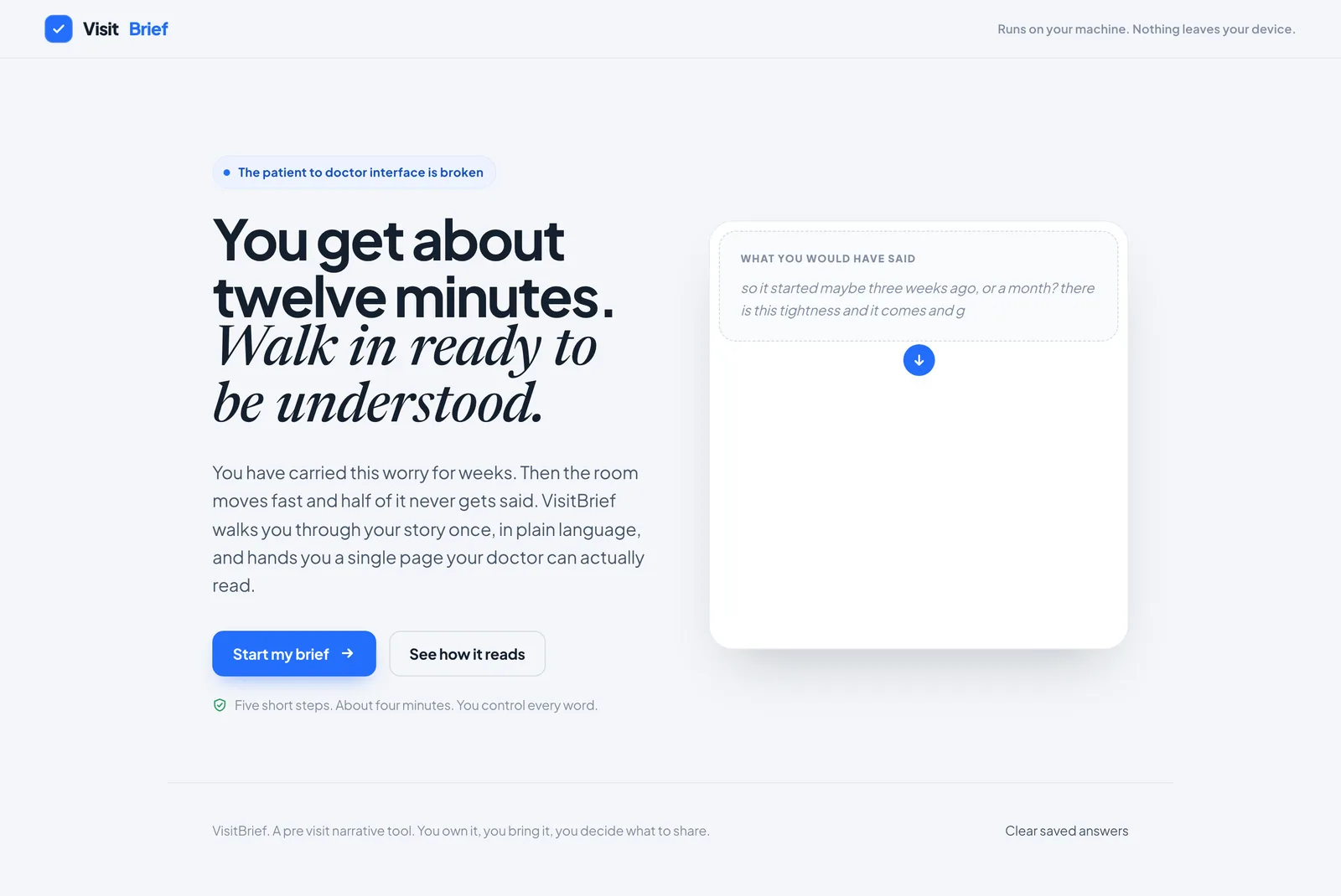
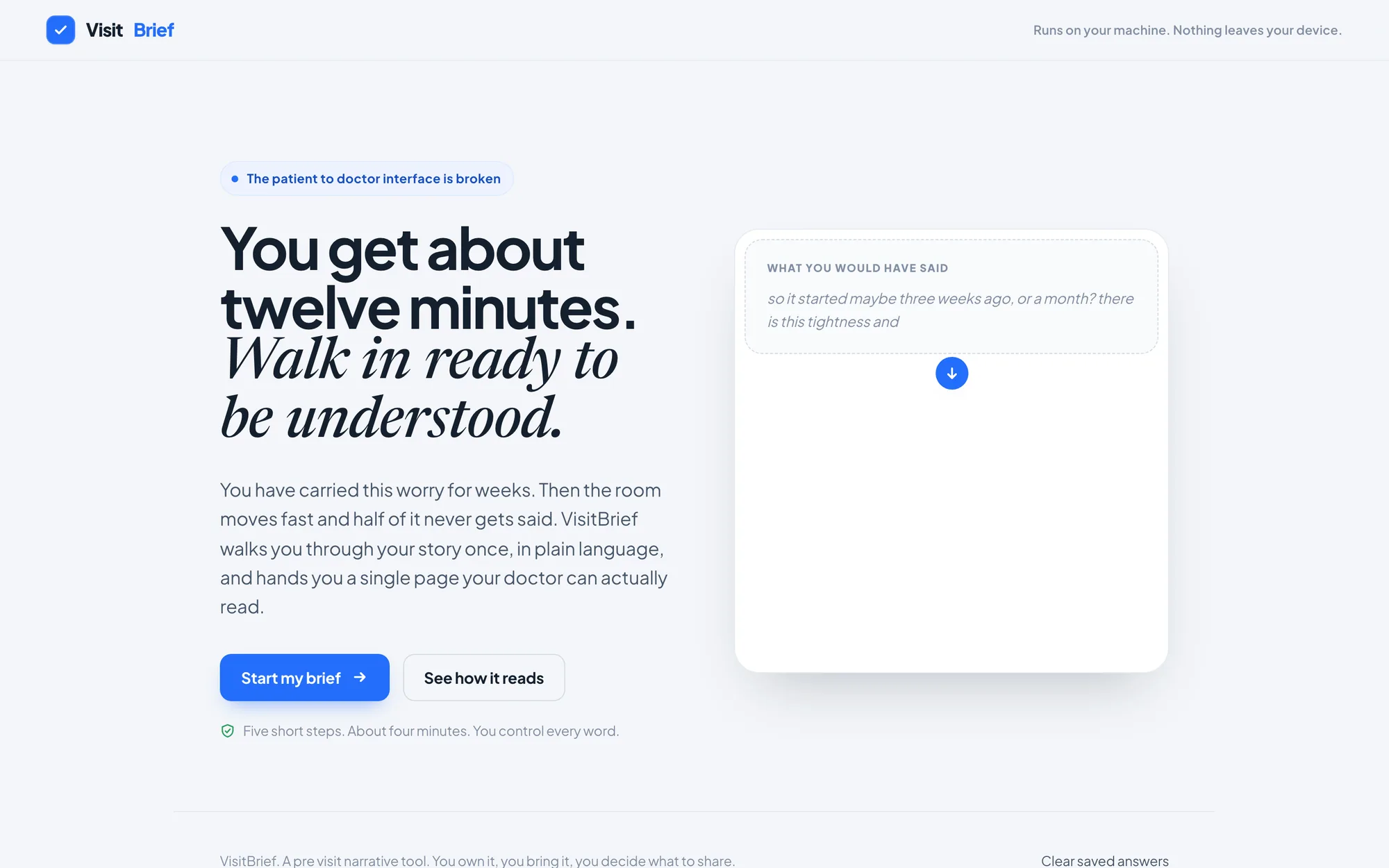
The hero is not a screenshot of the product. It is the product's argument: rambling becomes a brief, animated on load
See it work
A walkthrough of the full flow: the five step intake, the local model shaping the page, and the finished brief ready to print and carry into the appointment.
Visit Brief walkthrough: intake, generation on a local model, and the one page brief
The patient to doctor interface is broken
Records flow out to the patient through portals and printouts, but the patient has no good way to send a clear, prioritized story back in. You carry a worry for weeks, and then the room moves fast, the visit runs about twelve minutes, and half of what you meant to say never gets said.
The worst casualty is usually the most important sentence: the fear underneath the symptoms, which is often the real reason the appointment was booked. Patients ramble because worry rambles. Doctors think in timelines and priorities. Nothing in the room translates between the two, and the person with the least practice speaking the clinical register is the one with the least time to do it.
Let a nervous patient tell their story once, in their own words, and walk in holding a single page their doctor can scan in under a minute, without that story ever leaving their machine?
The scoping decision came first: Visit Brief solves only the half the patient controls. There is no clinician account, no records integration, no upload. The product deliberately stops at the piece of paper the patient owns, brings, and decides whether to share.
Five questions, then a document
The intake asks one question at a time, autosaves every keystroke, and paces a person who may be dreading the answers. Each question earns its place: doctors think in timelines, knowing what did not work saves everyone time, and the order of your three priorities tells the doctor where to spend the minutes if time runs short.
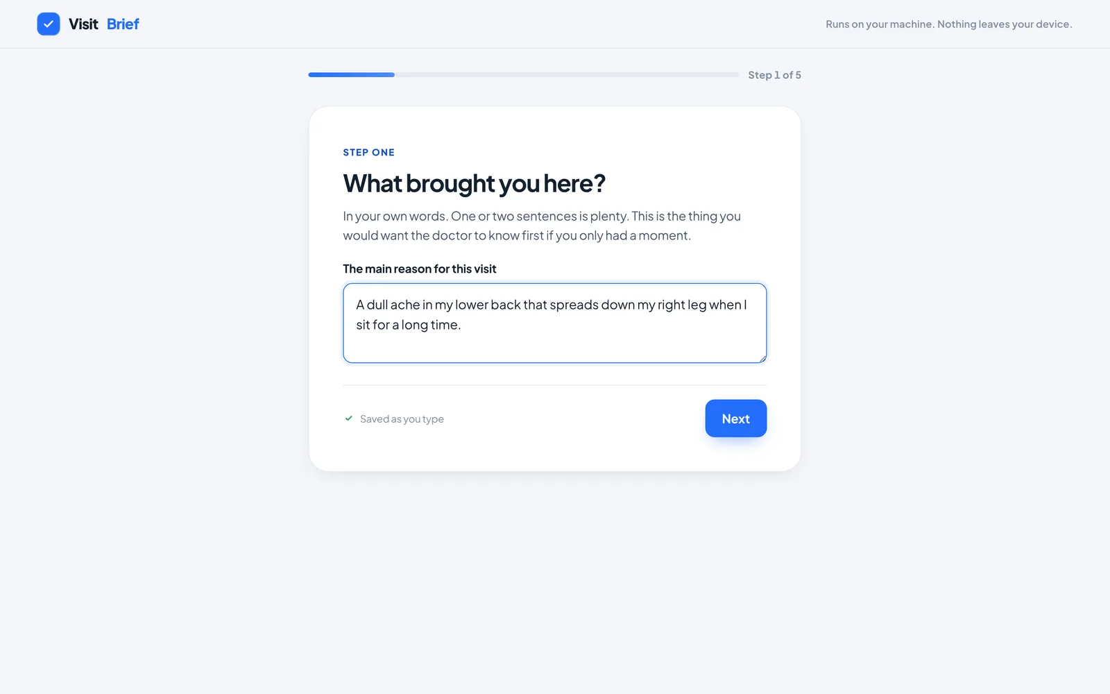
One question per screen, a progress rail, and the promise that matters to an anxious writer: saved as you type
The question underneath the question
Step four is the emotional core, and the only step that changes visual register mid app. The palette warms to amber, and the copy makes a promise: your brief will carry this with dignity, in your voice. That promise is not decoration. It reappears, almost word for word, as an instruction in the model prompt.
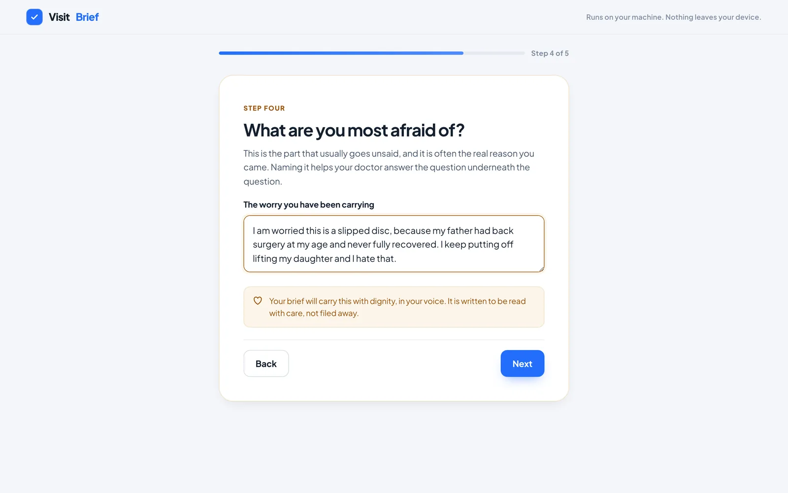
The fear step, in the warm register. Amber, not red, because fear on a medical form should be met with warmth, not alarm
An honest wait
While the local model works, the loading screen shows a miniature page assembling itself line by line, in lockstep with a checklist written in the product's voice: reading your answers, ordering the timeline, framing what matters most, laying out the page. The third skeleton bar is amber, because the third checklist item is the fear block. The loading state is a scale model of the output, down to the color of its one warm block.
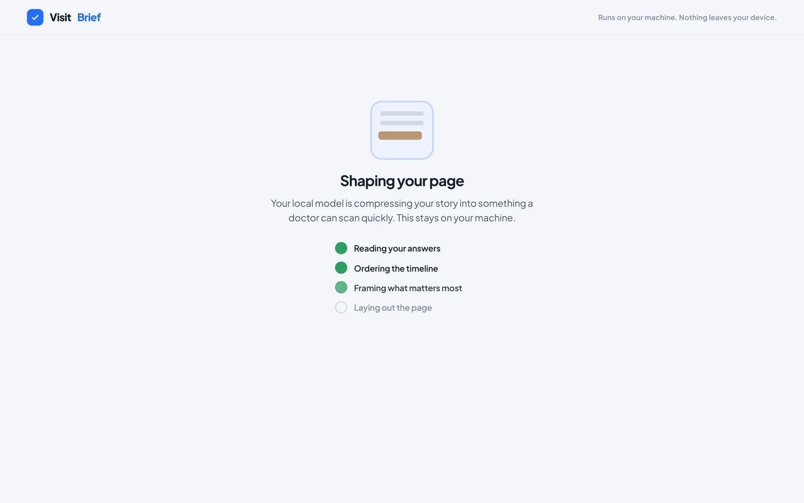
The generating screen repeats the promise at the moment of maximum sensitivity: this stays on your machine
The brief
The output switches registers completely: serif type, a masthead rule, a clinical layout sized to one printed page. The chief concern leads in large type. Priorities render as three numbered cards in the patient's own order. The timeline reads as a spine. And the patient's fear is the last thing on the page, in the largest body type, in the only colored block, so a clinician scanning top to bottom ends on the person.
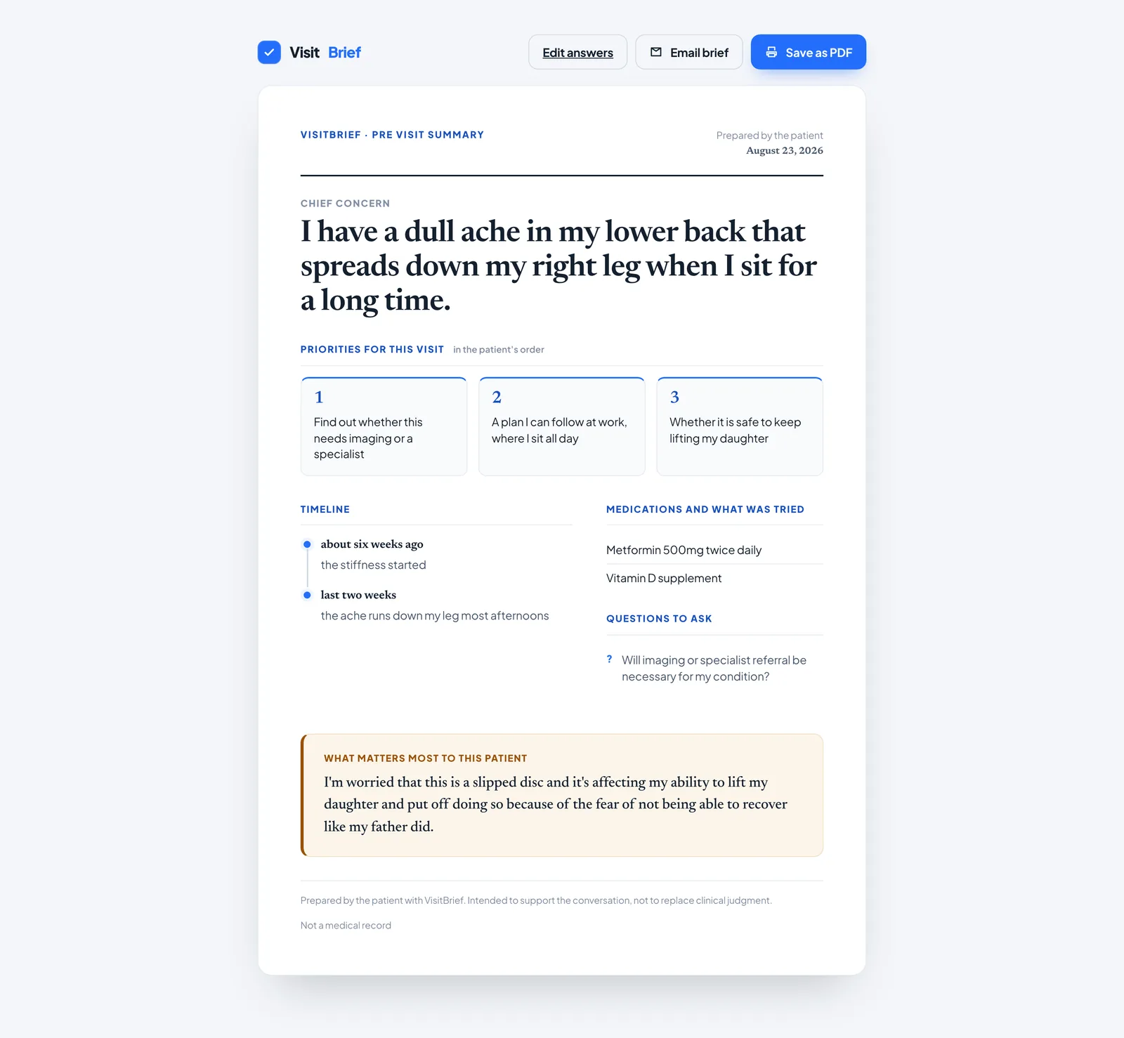
A real brief generated by the local model from a real intake. The footer states what it is and is not: prepared by the patient, not a medical record
Small enough to be audited by its users
Visit Brief has no framework, no build step, and no dependency a reader has to trust. That is not minimalism for taste. The product's core claim is that nothing leaves your machine, and a claim like that is only worth what a skeptical reader can verify. Anyone, including a clinician, can read all 1,584 lines and check it personally.
Application state is one integer: the current step. Everything else derives from it through a single render function that clamps out of range values, so the back button on step one and the next button on step five are harmless by construction rather than by disabled state logic. A single field registry maps the nine inputs, and that one map drives restore, read, autosave wiring, and clear. Adding a question is one line plus markup.
nine fields ──▶ localStorage (autosave, every keystroke)
     │
     ▼
buildPrompt(answers) ──▶ POST localhost:11434  (Ollama, llama3.2,
     │                    stream: false, format: "json", temp 0.3)
     ▼
extractJson() ──▶ normalizeBrief() ──▶ localStorage handoff
                                            │
                                            ▼
                                       brief.html renders
                                       (standalone, no app.js)
The handoff between intake and document goes through localStorage under versioned keys, never through the URL. A patient's stated fear in a query string would land in browser history and any referrer header. And the brief page is deliberately standalone: it loads no application code at all, reads its data, and if there is nothing stored or the data is corrupt, both failure modes resolve the same way, back to the start. There is no empty brief state to design because it cannot occur.
The two registers are enforced by the type system of the design, not by discipline. The sans face runs the app; the serif appears only in the brief. The serif escapes into the app in exactly four sanctioned places, and every one of them is a spot where the interface is pointing at the document.
Treating the model as an unreliable interface
The interesting engineering in Visit Brief is at the boundary between a small local model and a document a doctor will hold. A 3B model on a patient's laptop will wrap JSON in prose, drop fields, and improvise shapes. The product's job is to make sure none of that ever reaches the page.
1 · Four layers of defense against one unreliable interface
The same problem is solved four independent times. The prompt instructs: respond with only a JSON object, no preamble and no markdown fences. The request enforces it again with Ollama's grammar constrained JSON mode. Then the response passes through a syntactic recovery function anyway, because models sometimes wrap JSON in prose regardless:
/* Models sometimes wrap JSON in prose or fences. Recover the object safely. */
function extractJson(text) {
  if (!text) throw new Error("empty response");
  let t = text.trim().replace(/```json/gi, "").replace(/```/g, "").trim();
  const start = t.indexOf("{");
  const end = t.lastIndexOf("}");
  if (start === -1 || end === -1) throw new Error("no JSON object found");
  return JSON.parse(t.slice(start, end + 1));
}
The first brace and last brace trick survives both a chatty preamble and a polite postamble in one operation, and handles nested objects because it takes the last closing brace. The fourth layer is semantic: a shape guard that normalizes whatever parsed into exactly what the document needs. Its best decisions are a fallback chain three levels deep on the chief concern, so the largest headline can never be blank, and a hard cut of priorities to three, because the layout renders three columns and a model returning five would break the band. The layout invariant is enforced where the data is shaped, not patched in CSS.
The safest degradation is reserved for the most sensitive field: if the model garbles the fear, the patient's own sentence is used verbatim. When compression fails on the thing that matters most, the original words are already the right answer.
2 · The prompt is a safety document
The prompt opens with five words that do all the safety work: you are a careful medical scribe. The model is a compression function over the patient's words, never a diagnostician. The anti hallucination clause names its categories instead of gesturing: do not invent symptoms, diagnoses, dates, or medications that are not present.
You are a careful medical scribe helping a patient prepare for a short appointment.
Turn the patient's own words below into a concise pre visit brief that a busy
doctor can scan in under a minute.
Preserve the patient's meaning. Do not invent symptoms, diagnoses, dates, or
medications that are not present.
Keep language plain and human. Phrase the patient's fear with dignity, in the
first person.

Patient answers:
- Main concern: ${a.concern || "(not provided)"}
- Most afraid of: ${a.fear || "(not provided)"}
...
Two details show the prompt was reasoned about rather than pasted. First, suggested questions are deliberately absent from the forbidden list: it is the one field where the model is licensed to add something the patient did not write. Second, blank fields become the marker (not provided) rather than an empty string, because a dangling label invites a model to fill the blank while an explicit marker tells it the absence is data. And the dignity instruction closes a loop that starts in the interface: the step four UI promises the brief will carry the fear with dignity in your voice, the prompt instructs exactly that, and the document renders it in the amber block. A UI promise you can grep for in the prompt.
3 · Two registers, one product
The stylesheet opens by declaring the thesis, and the fonts enforce it as a rule rather than a vibe: the sans runs the app, and the serif appears only in the brief. Even the emotional palette is scoped like an API. The one warm note in the product has a documented boundary:
/* Care. The one warm note. Used only where the product holds space for the
   person: the fear, and the brief's "what matters most" block. Amber, not
   red, because fear on a medical form should be met with warmth not alarm. */
--care-ink: #9A5209;
--care-wash: #FCF5EA;
--care-line: #F0E1C6;
The scope is honored in the code: the care palette appears in exactly four places, and the separate alert red appears only for system failure, never for anything a patient wrote. Red is for the machine breaking. Amber is for a human being afraid. A two color semantic system doing real work.
4 · Fighting the PDF library for one page
The brief must be one page, and the export pipeline earns that the hard way. The capture library sizes its canvas from the live element before cloning anything, so the on screen card chrome had to be flattened in place and restored afterward, with the restore in a finally block so a failed export never leaves the page visually broken. And when the library's pagination produced a near blank second page, the fix went underneath the convenience API:
// html2pdf's own pagination can leave a near blank second page
// once content runs even slightly past one page of pixels. The
// brief is meant to be a single A4 page, so discard that slicing
// and place the whole capture as one image, shrunk only as much
// as needed to fit.
while (pdf.internal.getNumberOfPages() > 1) {
  pdf.deletePage(pdf.internal.getNumberOfPages());
}
Below that runs a hand written contain algorithm: fit to width first, fall back to fit to height, center horizontally, on a white base fill because JPEG has no alpha channel. The product constraint overrode the library default, and the code reached into the library's internals to make one page a rule instead of a hope.
5 · What was deliberately not built
There is no input validation, and that is a decision with an argument. Every field is free text narrative; there is no wrong answer to what are you most afraid of, and a validation error on that question would be actively harmful. The system degrades instead: blanks become (not provided), the shape guard supplies fallbacks, and a completely empty submission still produces a valid document. Autosave has no debounce for a similar reason: nine short fields serialize in a couple of kilobytes, and a debounce would buy nothing except a window where an anxious person's words could be lost.
The smaller calls that add up
Ollama's endpoint returns nothing until generation finishes, so the first two checklist ticks run on timers. The honesty lives at the endpoints: the final tick fires only on real success, and the timers are cleared on failure, so a failed run can never show a completed checklist. Perceived progress, with a floor of truth.
The recovery screen's comment is its philosophy: direction, not apology. It names what happened, lists the three terminal commands that fix it, offers try again, and repeats the one sentence an anxious user needs: your answers are safe and still saved. The sample preview button beside it lets the design be seen with no model running at all.
The preview builds its brief from whatever the person already typed and falls back to canned content only where they typed nothing, using an all or nothing merge for medications so it can never mix one real drug with one invented one. A half real medication list on a medical document would be genuinely dangerous, and the merge idiom makes it impossible.
Every step change focuses the first control with the preventScroll option, then runs its own smooth scroll to the top. Focus normally yanks the viewport; suppressing that lets keyboard users land on the field while sighted users get the intended motion. Two audiences, one line apart.
Bugs the code review could not see
Visit Brief has no test framework. Its verification discipline was running the real thing on real screens, and the repository preserves the evidence: an archived snapshot of the codebase from mid build, against which every later fix can be diffed. Two of those fixes are the best engineering stories in the project, because neither was fixable in the layer you would expect.
The first surfaced immediately after the snapshot. The original README said to just open the HTML file in a browser. Running it clean failed: a page opened from disk sends its request to Ollama with a null origin, and Ollama rejects it. There is no client side fix for that. So the fix shipped in documentation, with the diagnosis written down for the next person, and the marketing claim was narrowed to stay true: no build step, no keys became no build step, no keys, just a static file server.
This matters: opening index.html directly from disk (a file:// URL)
sends the browser's request to Ollama with a null origin, and Ollama
rejects that. Serving over localhost gives it a real origin Ollama
accepts.
The second came a week later, in a stylesheet only session. On common laptop heights, the tallest step pushed the Next button below the fold, and a nervous first time user who cannot see the button believes the form is broken. The fix was four coordinated values cutting about a hundred pixels of vertical rhythm, with the comment naming the exact failure, and the escape hatch deliberately kept: the textarea got shorter, but it still resizes taller.
/* Visibility of the primary action: a shorter default keeps the tallest step,
   two stacked text areas, from pushing Next or Build my brief below the fold on
   common laptop heights. Still roomy, and the person can drag it taller. */
textarea.control { min-height: 104px; resize: vertical; }
Auditing the finished build for this case study continued the same discipline: I fed the JSON recovery function eleven adversarial model outputs under Node. It correctly survived fenced JSON, chatty preambles, trailing sign offs, nested objects, refusals, and truncation. The audit also found where the defense runs out, which belongs in the next section rather than under the rug.
The archived snapshot turns the folder into its own history: every post snapshot change is diffable, and each one traces to a run discovered problem rather than churn.
The file headers name the UX principles, and the same words recur as inline comments at each decision they govern. Feedback, usability, consistency: greppable, not aspirational.
The landing animation honors the reduced motion preference at three layers: a global CSS kill switch, targeted overrides for the states the kill switch cannot fix, and a JavaScript early return that skips the typewriter entirely.
The typewriter reads its text from the markup, so pretty printed indentation made it spend its first half second typing invisible whitespace. The fix was deleting a newline in HTML: a bug that only exists at the seam where formatting for humans becomes data for code.
A finished tool, and the audit that follows it
Visit Brief shipped complete: a five step autosaving intake, a prompt engineered as a safety document, four layers of model output defense, a two register design system, a one page document with print and PDF export, and a recovery screen that turns failure into a runbook. It runs on any static file server next to a local model, and the patient's story stays home.
In a product this small, the codebase itself is the trust document. No framework and no build step means a patient or clinician can read every line and verify the privacy claim personally. Auditability is not a nice property of the architecture. For a health tool with no company behind it, it is the architecture.
What I Would Fix First
Auditing the shipped build surfaced three real defects worth naming. First, the shape guard checks that fields are arrays but never coerces their elements to strings, so a model returning structured medication objects would render literally as object Object on a medical document; the fix is one String call in the normalizer. Second, the error taxonomy is wired to the wrong predicate: parse failures show the could not reach Ollama message, sending the user to restart a service that is already running, and the message never resets between failures. Third, two late features quietly outgrew the privacy sentence printed on every screen: the sample preview became a landing page button without gaining a watermark, so a fabricated brief is indistinguishable from a real one, and the email button hands the story to a mail client while the words nothing leaves your device are still visible above it. The honest fix is a sample ribbon, and either dropping the email button or narrowing the claim to one that stays true.
What I Learned
Visit Brief taught me that the boundary is the product. Almost every decision that matters happens where an unreliable model meets a document with real stakes: the prompt that constrains, the layers that recover, the normalizer that guarantees shape, the fallback that returns the patient's own words when compression fails. And the audit taught me the sequel: features added after the promise was written are where promises quietly break. The next version starts by making the claim and the code agree again.
Between a five field form and a one page document sits all the real engineering: constrain, recover, normalize, and degrade toward the user's own words.
The best fix in the project shipped in a README, and the most dangerous bug lives in a sentence the interface can no longer fully keep. Words are part of the system and need the same review code gets.
The recovery screen, the sample preview, and the autosave promise all exist for the run where things go wrong. For a nervous user, the failure path is the product's character under pressure.
Five files that a stranger can read in an evening beat a framework app nobody audits. Every dependency the product refused is a claim it no longer has to defend.