At a Glance
Role: Brand and Packaging Designer, solo
Platform: Physical packaging, beverage cans
Outcome: A full identity and packaging system across four cans and a seven frame launch deck
Liquid gold, lightly sparkling
Zarrin is a concept brand for a saffron sparkling water: real saffron, cold steeped in crisp carbonated water, with nothing added and nothing hidden. The design work spans the name, the bilingual identity, a four flavor packaging system, and the launch deck that introduces them.
The premise is that saffron already owns the imagery a premium beverage wants: it is the most expensive spice on earth, harvested by hand from a purple crocus, three red threads at a time, and it has meant celebration in Persian culture for three thousand years. The brand does not need to invent a story. It needs to set the one it inherited, the way a jeweler sets a stone.
My Role
Brand and Packaging Designer · Naming, identity, illustration, packaging system, and launch deck, designed solo
Deliverables
Wordmark and bilingual lockup · crocus emblem and ornament system · four can designs · flavor color architecture · seven frame launch deck
Saffron was meant to sparkle
The category this product enters is crowded with white cans, pastel fruit, and the word clean. Zarrin positions against all of it. Sparkling water framed not as restraint but as occasion: the golden hour drink, poured over ice at the end of the day.
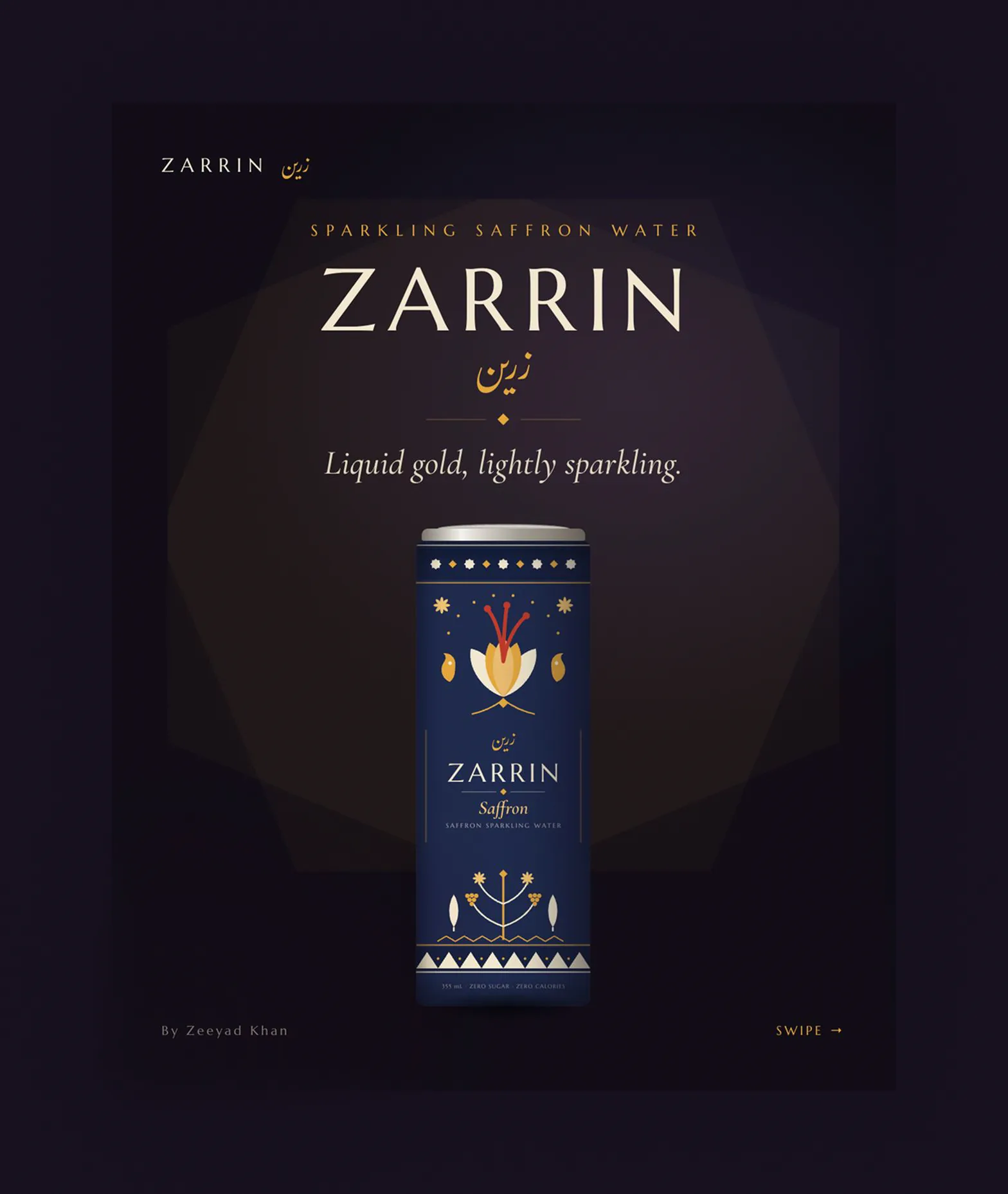
The cover frame sets the register: dark ground, gold accents, serif wordmark, and the flagship navy can
The voice keeps the same posture as the visuals: short declarative lines that treat the ingredient with respect and the drinker as an adult. Saffron was meant to sparkle. Golden, by nature. Nothing added, nothing hidden. The manifesto frame carries the whole pitch in three sentences and one honest ingredient claim.
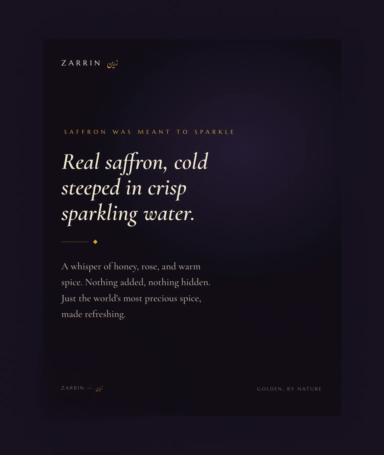
The manifesto: the product explained in the brand's voice, set in the document serif over the dark ground
Two scripts, one flower, and a garden
The identity is built from three elements that repeat on every surface: a bilingual lockup, a botanically honest crocus emblem, and an ornament vocabulary drawn from Persian textiles and garden architecture.
The lockup pairs the Latin wordmark, set in letterspaced serif capitals, with the name written in Persian script above it. The Farsi is not a decorative flourish tucked into a corner. It sits first, above the Latin, gilded in saffron gold, because the heritage is the headline of this brand and not a footnote to it.
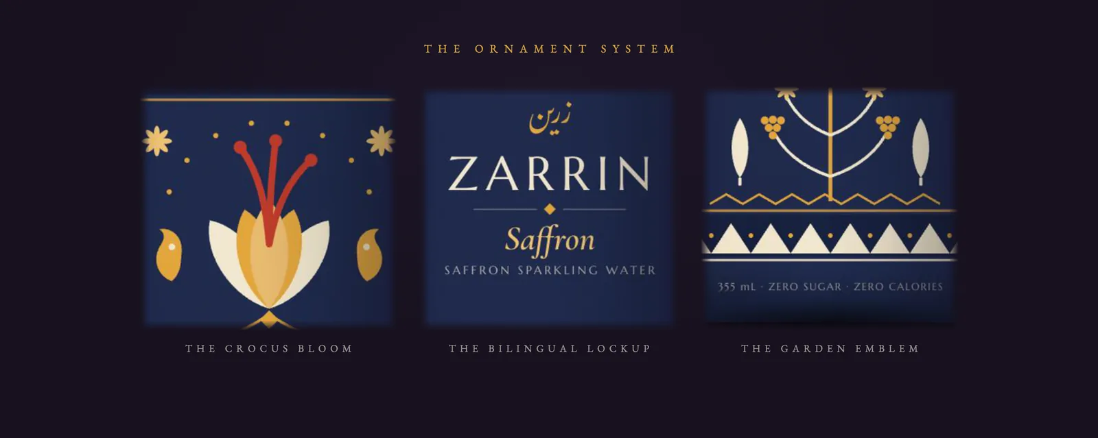
The three recurring elements at can scale: the crocus bloom, the bilingual lockup, and the garden emblem
The crocus emblem is the heart of the system, and it is drawn to tell the truth. Saffron is the dried stigma of the crocus flower, three red threads harvested from each bloom by hand. So the emblem is a stylized crocus with exactly three red stigmas rising from it, flanked by golden boteh, the paisley form that began in Persia. Below the lockup sits the garden emblem: a stylized tree flanked by cypresses, the oldest shorthand in Persian art for paradise, which was itself originally a word for a walled garden.
One garden, four palettes
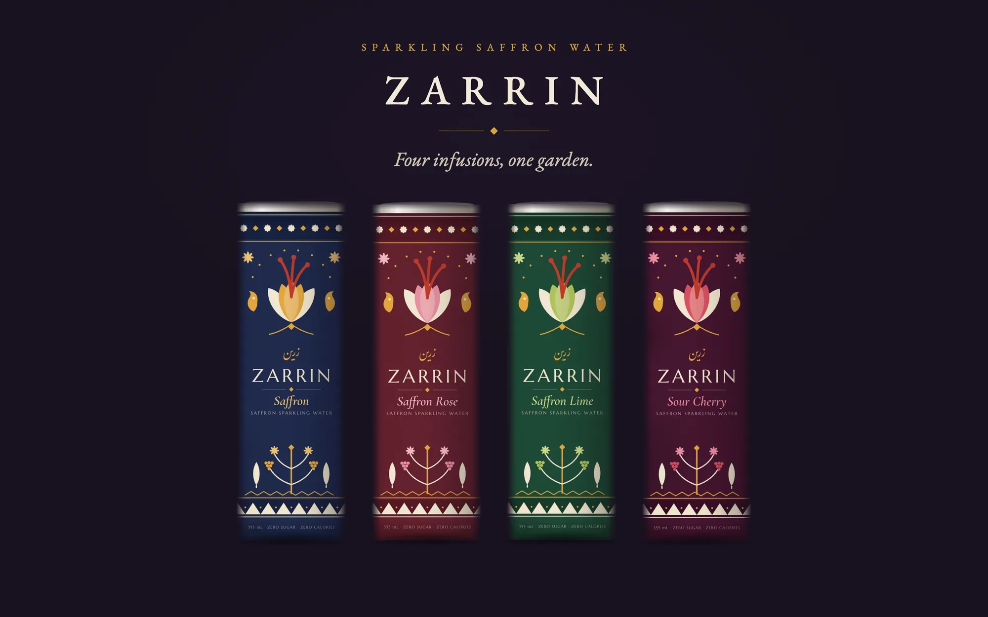
The line launches with four infusions: Saffron, the original, plus Saffron Rose, Saffron Lime, and Sour Cherry, each flavor a companion the spice has kept in Persian kitchens for centuries. Each one gets its own jewel tone, sampled straight from the finished cans.
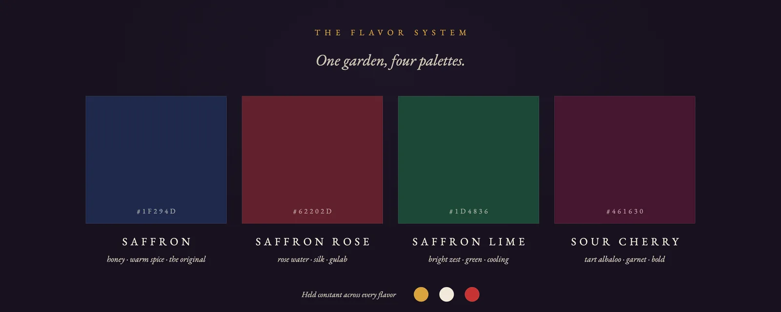
The flavor architecture: four grounds, each with its tasting notes, and the three constants held across every can
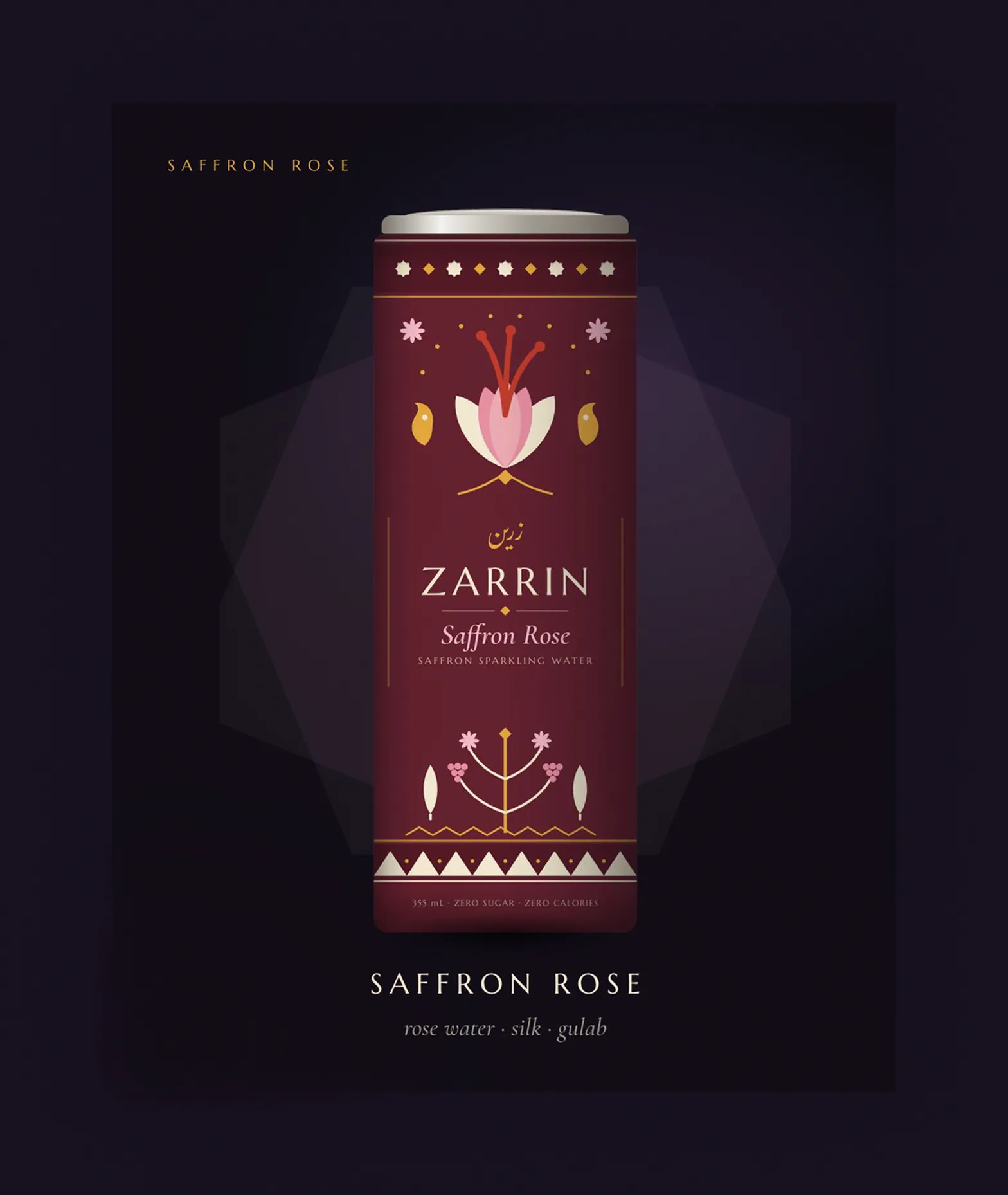
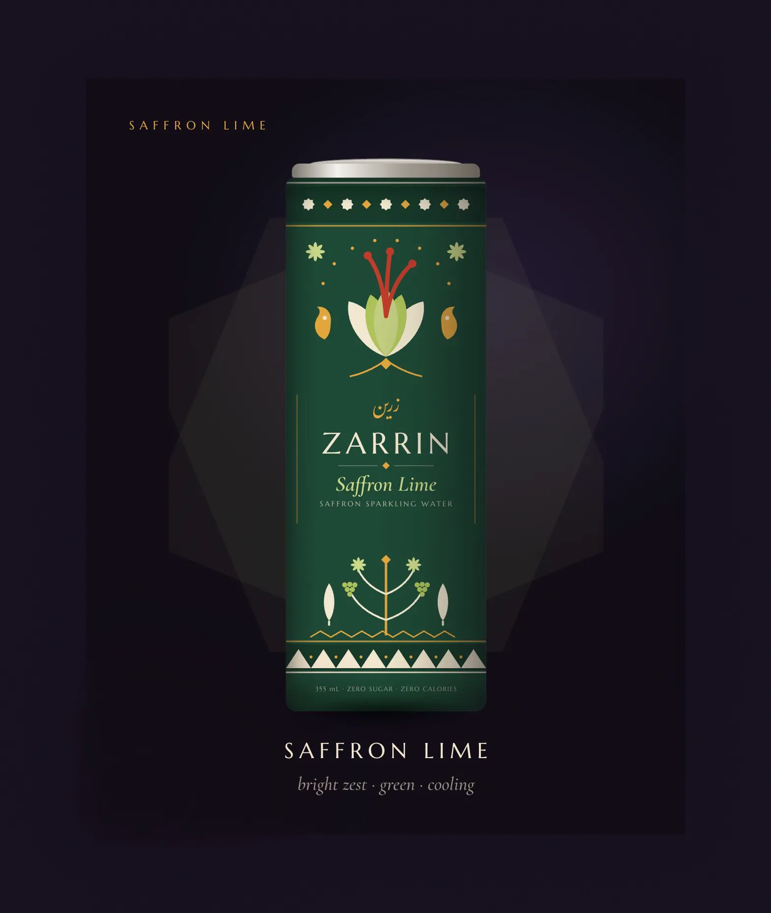
Saffron Rose in burgundy silk, Saffron Lime in emerald. The ornament recolors; the structure never moves
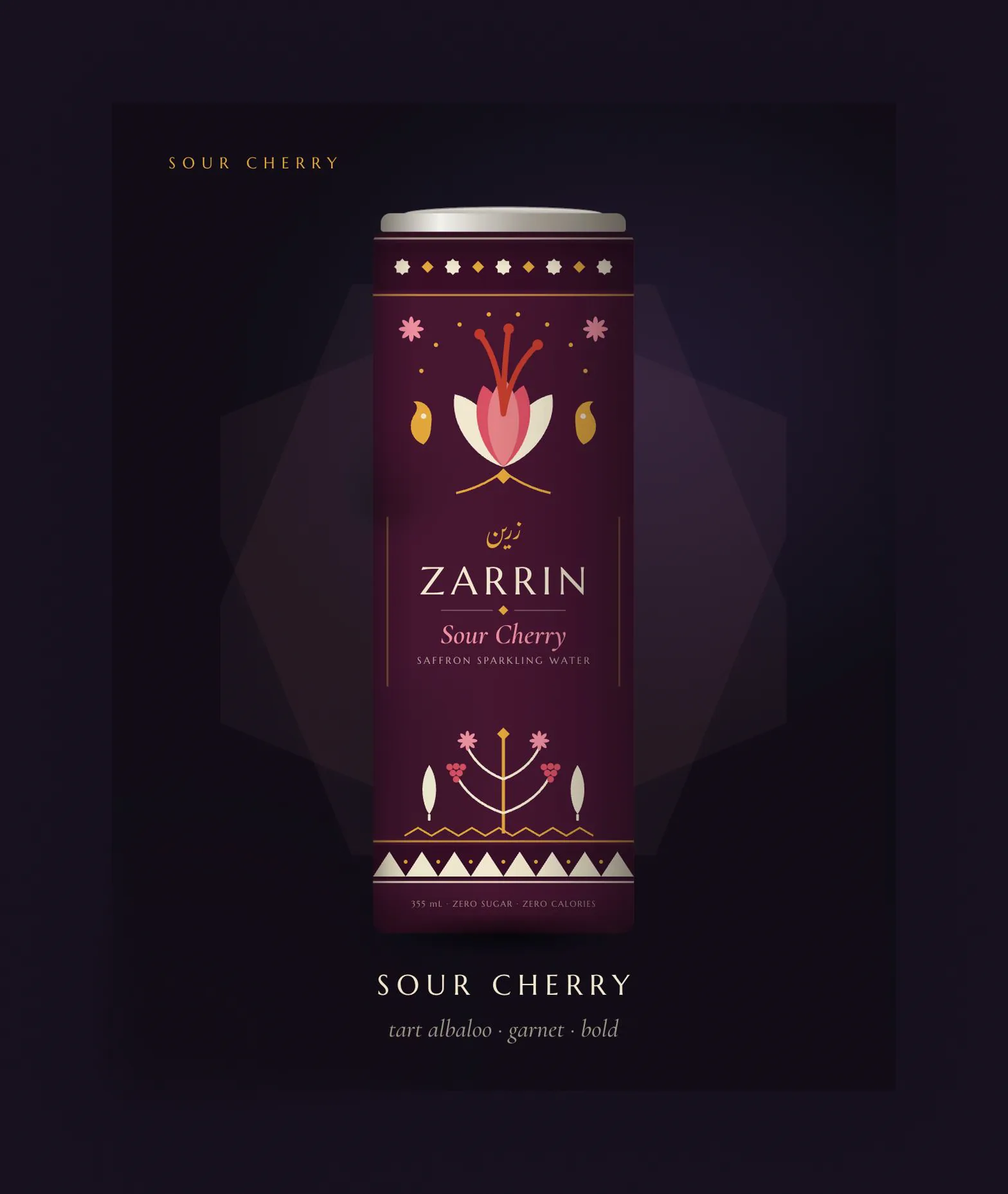
Sour Cherry, the boldest of the four: tart albaloo in a garnet ground, named for the Persian cherry it steeps
A can composed like a carpet
The can is organized the way a Persian rug is: a bordered field with a medallion at its center, read top to bottom in bands. A star and diamond band under the lid, the crocus bloom as the upper medallion, the bilingual lockup at the heart, the garden emblem below, and a triangle border grounding the base.
Everything on the can sits on a strict vertical axis, in perfect bilateral symmetry, because symmetry is how both textiles and luxury labels signal order and intent. The only asymmetric marks are the scattered star sparkles around the bloom, and they are the point: the sparkle is the one thing in the composition that is alive. Functional copy stays in one quiet line at the base, 355 mL, zero sugar, zero calories, small and tracked wide so it reads as an engraving rather than a claim.
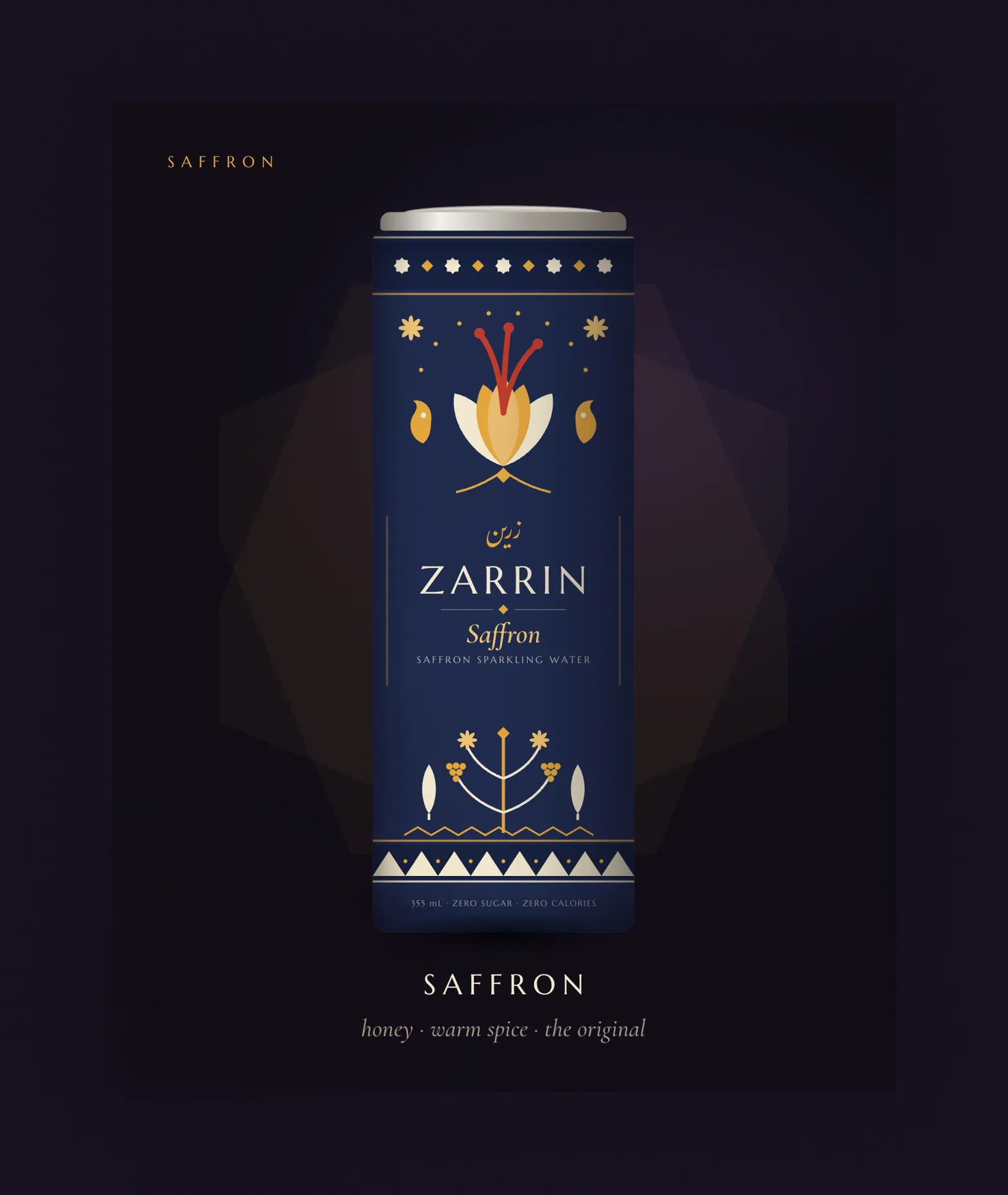
The flagship: golden petals on midnight navy, the one can where the flower carries the color of the spice itself
Why Zarrin looks the way it does
Every choice in this identity argues against a category default. The decisions below are the ones that define the brand, and each one trades an easy convention for something the concept can actually own.
1 · Dark ground in a white category
Premium sparkling water has settled on a formula: white or pastel cans, thin sans serif type, fruit photography or minimal line art. It reads as clean, and it all reads the same. Zarrin goes to the opposite pole, near black grounds borrowed from wine labels and perfume boxes, because the product story is evening, occasion, and gold. On a dark ground the saffron gold actually glows, the jewel tones register as jewels, and on a shelf of white cans the family reads as one unmistakable dark block.
2 · The Farsi sits above the Latin
The safe version of a bilingual lockup puts the English name large and the original script somewhere small, a garnish of authenticity. Zarrin inverts the hierarchy on every can: the Persian script comes first, gilded, and the Latin serif carries the retail legibility below it. A shopper who cannot read Farsi still reads ZARRIN instantly; a shopper who can read it sees their language honored in first position. The lockup does different work for different audiences, and neither is an afterthought.
3 · The emblem is botanically honest
The crocus bloom is drawn with exactly three red stigmas, because that is what saffron is: three red threads inside each purple crocus, pulled by hand. Across all four flavors the petals recolor to match the infusion, gold on navy, pink on burgundy, green on emerald, but the stigmas stay red on every can. The spice is the constant; the flavor is the variable. The packaging teaches the product architecture without a word of copy.
4 · Jewel tones instead of fruit colors
The lazy flavor system paints the lime can lime green and the cherry can cherry red, and the family falls apart into a candy shelf. Zarrin assigns each flavor a jewel: midnight sapphire for the original, burgundy silk for rose, deep emerald for lime, dark garnet for sour cherry. Every ground is dark enough to hold the gold and cream at full contrast, so the four cans read as one family at ten feet and four distinct flavors at two.
5 · One template, four skins
The four cans share one fixed composition: identical band structure, identical lockup position, identical emblem geometry. A new flavor is a palette decision, not a layout project. That discipline is what makes the family lineup look inevitable, and it is also the practical argument a real brand needs: the system scales to a fifth and sixth flavor without a redesign, and the shelf blocking gets stronger with every addition.
The smaller calls that add up
The wordmark is set wide, in classical serif caps, the way a name is engraved on jewelry or cut into stone. Tight modern sans would say tech; this says heirloom. The generous tracking also lets the seven letters hold the full width of the can panel with no logo mark needed.
Flavor names are the one line set in italic serif, lowercase warmth against the engraved capitals everywhere else. The brand speaks in stone; the flavor speaks in a human voice. It is the same two register logic as a formal invitation with a handwritten name.
The ornament runs on exactly two inks over each ground: saffron gold and silk cream, with red reserved for the stigmas alone. Persian ornament earns richness through repetition and rhythm, not through more colors. Restraint is what keeps dense decoration from becoming noise.
The concept ships as a seven frame deck, cover, manifesto, four flavors, and a closing invitation, built for the swipe. A beverage concept lives or dies on social first, so the deliverable is designed for the feed it would actually launch in, under the handle drinkzarrin.
A shelf ready family from one idea
Zarrin shipped as a complete concept: name, voice, bilingual identity, a four flavor packaging system built on one disciplined template, and a launch deck that presents it the way it would meet the world. The presentation boards on this page, the family lineup, the flavor architecture, and the ornament details, were composed from the finished can art to show the system the way a brand guidelines page would.
The strongest brand ideas are the ones the product already contains. Saffron brought the gold, the flower, the garden, and three thousand years of meaning. The design work was choosing what to leave out: two metals, one template, one honest flower, and a category convention declined at every fork.
What I Learned
Zarrin taught me that a packaging system is an argument about the future: every rule in the template, the fixed bands, the constant stigmas, the two metal limit, is a promise about what flavor five will look like before it exists. It also sharpened a conviction that carried into my product work: heritage reads as premium when it leads, and as decoration when it trails. Put the Farsi first and the whole brand stands up straighter.
Designing the template once and the palette four times produced more coherence than four bespoke cans ever could, and it turned every future flavor into a solved problem.
The three red stigmas are the same discipline as an accurate diagram: the most beautiful version of the emblem turned out to be the botanically true one.
Every early exploration that followed category conventions disappeared into them. The design only became a brand when it picked the opposite pole and held it everywhere.
Liquid gold, lightly sparkling did as much branding work as the wordmark. The visual system and the writing hold the same posture, and either one alone would be half a brand.
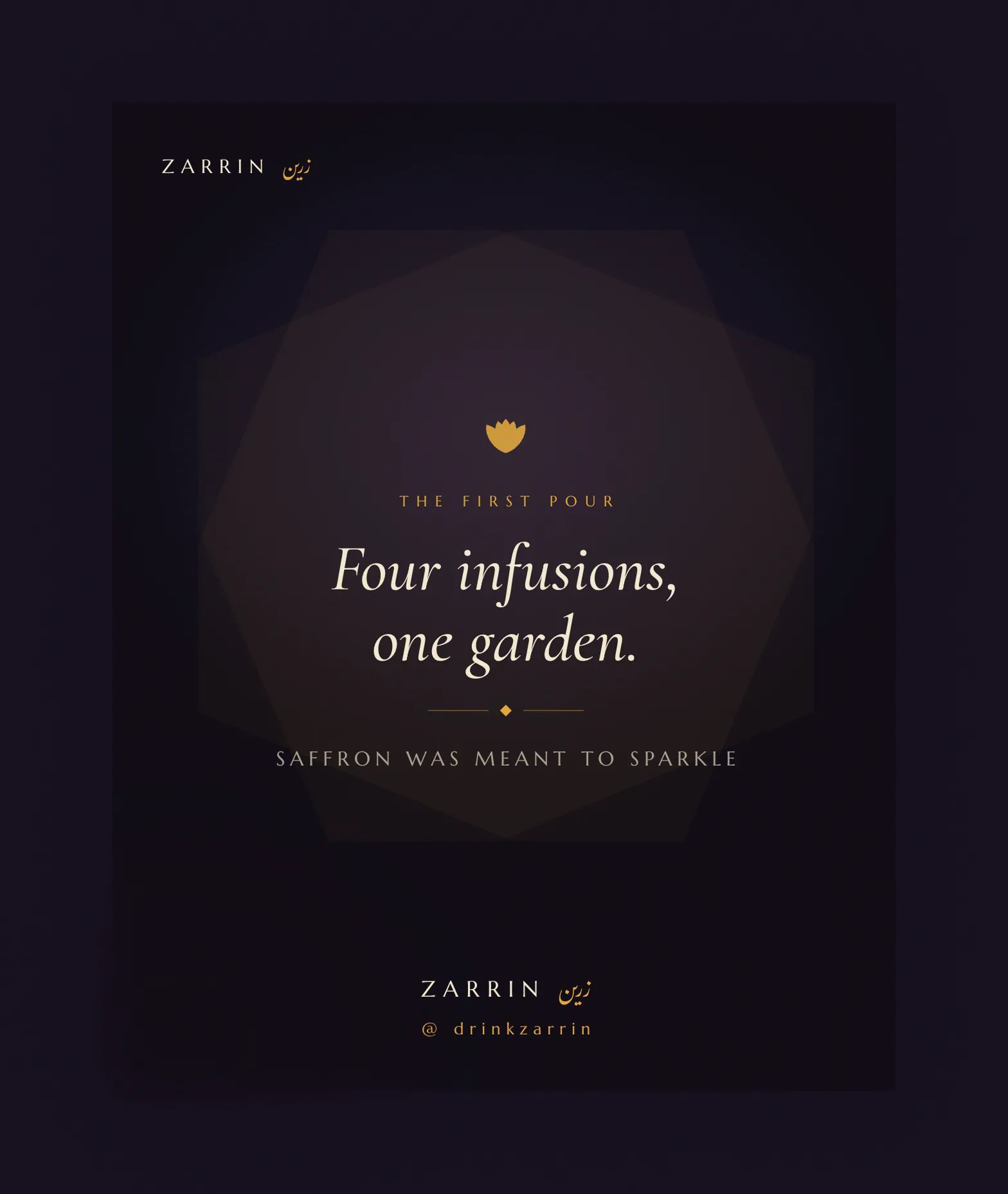
The closing frame. Four infusions, one garden